WHEN URBAN DECAY COSMETICS was founded in 1996, the company had a unique vision of the market they were after. Far from mainstream but greatly successful nonetheless, Urban Decay’s commitment to edgier fashion statements has served them well, and innovative products, fresh package design ideas, and intriguing color names keep its cosmetic products in demand at boutiques such as Sephora and Macy’s.
Wende Zomnir, also know as “Ms. Decay” or the executive creative director at Urban Decay, explains why the target Urban Decay consumer fits a lifestyle rather than a demographic. In a way, defining the potential customer first is what defined the Urban Decay design tone. Zomnir explains that the company “preselected” its customer, and that her age has less to do with the equation than one might assume.
The Urban Decay consumer — both loyal and potential — now knows what Urban Decay’s niche is, and although the packages and promotions do not have to educate the consumer in that way, they still have to be intuitive. “It’s definitely a niche, and it has to be authentic,” Zomnir emphasizes. “The design has to be easy to use and easy to understand, or it’s not going to work.”
Magical designs
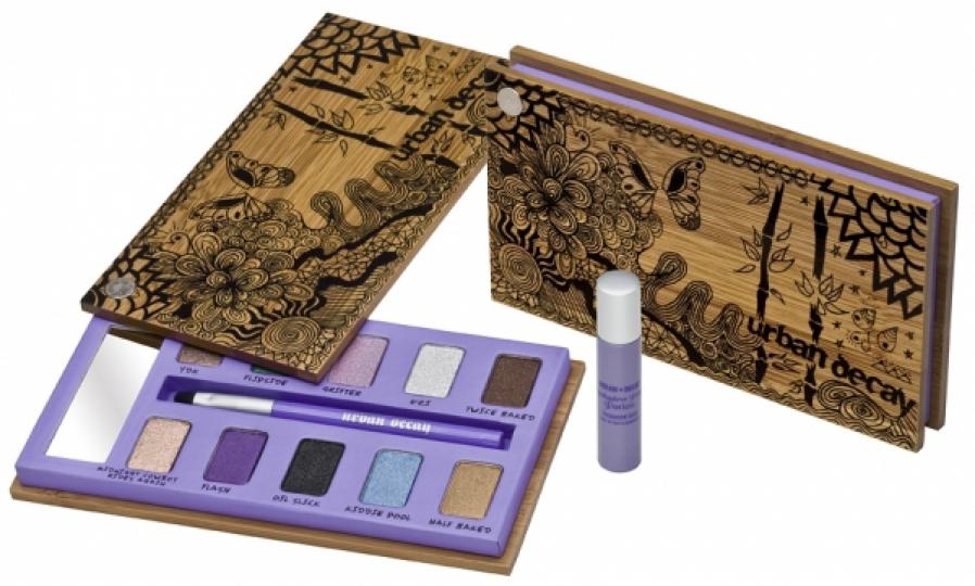
This fall, Urban Decay, based in Newport Beach, CA, is introducing a line of products that springboards from the success of its popular Eyeshadow Primer Potion, introduced in the 2004/2005 winter season. The effectiveness of the product surely was the primary reason for its success, but the unique packaging both set the product apart and opened doors of opportunity. “It looks like a magical potion on your dresser,” Zomnir says. “We let the package tell the product story.”
An ambitious fall line is building on the product and package design themes of the Eyeshadow Primer Potion and its magical qualities. There are design tie-ins with similar caps and colors, and the graphic treatments are expanded into organic flourishes of leaves, vines, mushrooms, and stars pouring out of uncorked genie bottles.
Many consumer product companies with a high turnover of packages are finding production schedules contracting. As Urban Decay’s design and production department is lean and mean, coordinating many components simultaneously, they are experiencing the opposite. “We’ve actually been taking a little longer to make sure everything works right,” says Zomnir.
Advertisement
The Inks for Eyes package, for example, is a very functional package that took some refining to combine portability with performance. A thin travel case with a brush goes against the convention of swirling the brush to get the eyelid color on the brush. The package promotes a stroke motion with an angled brush to get perfect application of color onto the brush and precise application to the eyelid. The smudger end of the wand also went through many revisions to get the functionality just right. The attractive package was finished off with a mirror effect on the base, clear sides, and a screen-printed peacock on the lid.
Uncorked creativity
Amy Zunzunegui, product development director at Urban Decay, explains how they are always developing a number of ideas that are not even on the production schedule yet. “There’s always numerous, numerous products,” she says, and each product and package design is considered on a product-by-product basis. “Everything has its own little personality, but is still part of Urban Decay.”
Tim Warner, general manager at Urban Decay, says that having many products in the pipeline make it easier to introduce timely lines to fill market needs. “It’s just about having a lot of products and ideas,” he explains. “We usually have more than enough, then it’s focusing down on what’s relevant to the moment.”
The design teams look for inspiration in many areas, pulling from many influences, and their design processes are more organic than formulaic. “Anything creative, you can’t make it into a system,” Warner explains.
Besides periodic tweaks to package design ideas that work, many product and package designs each cycle start from scratch. During exploration, the Urban Decay design team will take an idea to off-the-chart outrageousness (even for them) then bring it back to a manageable amount of outrageousness.
The team makes conscious efforts never to feel boxed in. “You can’t standardize our process,” Zomnir says. “You’ll kill it if you standardize it.”
Advertisement
Zomnir is pleased with the way this Fall 2009 line was able to achieve subbranding elements, clear Urban Decay umbrella status, and free-standing identities. “It’s all presented together in a cohesive unit,” she says “Each piece feeds the other pieces. What’s fun about Urban Decay is each product tells its own story.”
Zunzunegui explains how the design sensibilities of the new line position all the primer stories to be similar. The consistent elements even include printing on foil board for the secondary paperboard boxes, which is an unusual direction for Urban Decay. But, then again, the design history of Urban Decay empowers them with a great deal of freedom. “We set that bar from the beginning,” says Zunzunegui. “We can totally push the envelope.”
Freedom to experiment
“We can go in places a lot of other brands can’t go,” Warner agrees. Now that the many precedents have been set, he explains, they risk disappointing their loyal customers with unadventurous design. Warner believes there is a natural brand umbrella at Urban Decay that allows for creative line extensions that both cause customers to take a leap of faith and push retailers to bend their merchandising rules.
“You know to take everything retailers say with a grain of salt,” says Warner. “Their input is important, but you have to balance it. We ultimately make our own decisions, and retailers are usually overwhelmed with what we do.”
Building on the franchise the company already has might be easier than with other brands because of the freedom the consumer allows the brand. “We know what our strengths are, and we’re always looking for new opportunities,” says Warner. “Ultimately, the consumer votes on the product.”
Much of Urban Decay package design inspiration comes from the fashion industry. Wherever a small element of design, texture, or color strikes a chord with a staff member, she will collect that sample or idea. However, the staff does not closely monitor what their close cosmetic competitors are up to. “We’re aware of what they do, but we’re not really influenced by what they do,” says Zunzunegui. “We’re kind of on our own playing field.”
Warner tries to identify opportunities in the market while trying to predict what will be popular, to better manage inventory to fulfill the flow of the demand. A lot of time and effort is put into staying one step ahead of the market—which is very fickle—with ongoing evaluations of product demand. “It’s all moving in different speeds,” Warner says, “but you can usually tell in three or four weeks how its performance is going to be.”
Advertisement
Networks you can rely on
Zunzunegui explains that Urban Decay relies heavily on the instincts of its product and package design team. Of course, sometimes ideas just flow and sometimes it is a struggle.
Feedback from the sales force is very important, because it lets the team gauge the likes and dislikes of their most ardent supporters. Mix in a healthy amount of temperature-taking on Internet social networks, and Urban Decay can be confident that they are addressing a need with a functional product in trendy packaging.
“It works for us,” says Zunzunegui. “We are our target customers. Everyone here is very passionate about what we do.” Endowing the the shades of its cosmetic products with clever and edgy names is another art form at Urban Decay. The optimal approach is to try and just let the creativity happen, but they are willing to find inspiration for names just about anywhere. Ideally, every name has a meaning—whether relevant or obscure—even if the only ones who “get it” work inside Urban Decay.
Urban Decay dedicates one full time person dedicated to social networking strategies. The company uses outreach campaigns to confirm thoughts, suspicions, or insights. Also, if a customer tweets a thought about an Urban Decay product, she is likely to get a retweet, reply, or mention from Urban Decay for her trouble. One outreach on a social networking site elicited 600 valuable responses in just two days. “It’s a good gut check,” says Zomnir. “It can point you in the right direction.”
The staff hopes that the enjoyment of creativity and the diligent attention to detail that they bring to the product and package design are contagious with their customers. “We’re always reinventing the wheel, which makes it fun,” says Zunzunegui.