Makeover Challenge
Makeover Challenge Concept Reveal: Bear Rabbit Design Studio
Bear Rabbit Design Studio
Bear Rabbit Design Studio earned high marks from Ellie Thomas, Makeover Challenge project lead and graphic designer at Starlight Distillery and Huber’s Orchard and Winery, for its presentation style. “This is the first presentation that I saw,” Thomas remarks. “I didn’t know what to expect from a blue-sky concept contest. I loved how their whole presentation looked. I was able to show it to my boss the same day. It was made very nicely—even if the concepts weren’t ones that we would use.”
Bear Rabbit Design Studio decided to push against the creative brief box by re-imagining the bottle structure versus sticking to the use of stock bottles. This would require investments for Huber’s that they wouldn’t make, as Thomas explained, because Starlight Distillery wouldn’t want to have to pass along significant costs to the consumer. But Stephen Graham, design director, Bear Rabbit Design Studio, felt that it was important to recognize the untapped branding potential of a distinctive structural design.
Advertisement“I think one of the reasons why we were included in this conceptual project is that we really don’t even acknowledge that there’s a box there,” Graham says. “I get into trouble all the time because I don’t color inside of the box.
“My argument to companies that are growing is that you need to stand apart,” he continues. “That doesn’t mean that you have to have a large investment, but it also doesn’t mean that you have to utilize the stuff that you used in order to get to that point.
“These brands have to stand out some way,” Graham adds. “Labeling works really well, but I think structure kind of elevates a product. I know, obviously, that structural changes will probably make the products more expensive to manufacture.
“But if the product inside the bottle is phenomenal, which it probably is, because they really take the time to harvest it and make small batches of this stuff,” he says. “Stock bottles just don’t reflect that.”
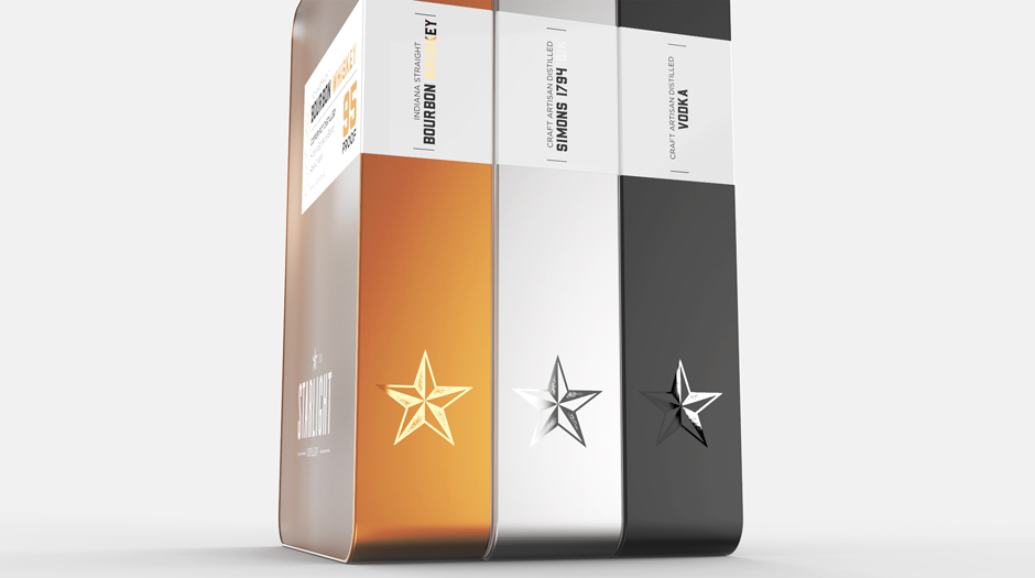
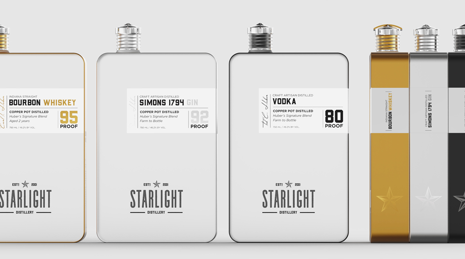
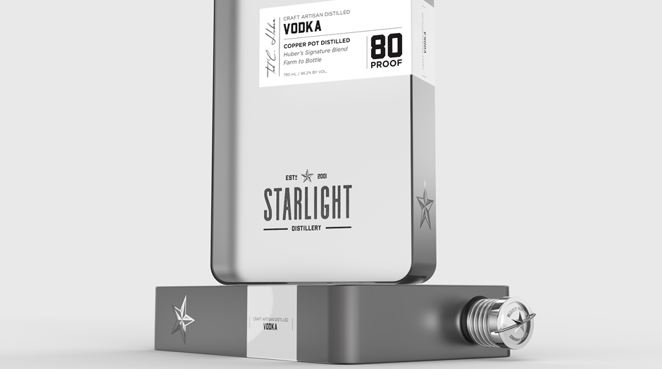
The approach detailed in the creative brief, he explains, also didn’t reflect the holistic approach of Bear Rabbit, where Graham pairs his structural design expertise with the graphic design capabilities of Christina Page, principal, Bear Rabbit Design Studio. Instead, Page explains, they examined the design in whole from top to bottom. “Starting with the cap, it is structured off of the actual distillery,” she explains. “When they open the still, there’s a lever and that lever is what is represented on the cap. This lever turns to open the still. The stars that go across the lever are also representative of the actual still that is made to use the product.”
AdvertisementGraham explains, “The star is a very important branding element for this company, and we wanted to respect that part of their heritage and acknowledge the elements that worked from the creative brief.”
A star was also included in the top of the bottle cap. “We like the caps because it’s a historical approach to the story and it’s recognizable, like the shape of the rectangular bottle. This bottle is visually striking from the front, from the side and from the top.”
Although there are historical elements to the design, Bear Rabbit’s goal was to create a clean, modern look that takes as, Graham puts it, “a no BS approach to showing exactly what it is.” He adds, “This label, especially the logo itself, is just clean. It’s simple, and it’s a combination of what 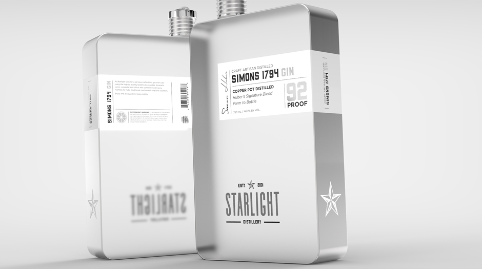 we wanted to achieve and even keeps a bit of Ellie’s design.”
Graham believes they have created a package design that will be distinctive enough to become a collectible and will elevate the Starlight Distillery brand significantly in awareness and prestige. And he argues that it still falls within the real-world business parameters because the idea behind the directive in the creative brief was to protect margins. This design would protect margins by increased sales. “I get criticism all the time when I go out paths like this,” he admits, “I often hear, ‘yeah, it’s cool looking, but it’s not going to fit in the filing and it needs to be more expensive.’ All you have to do is sell more, sell more and this product will sell more for you.”
VOTE NOW
You can cast your vote now for Bear Rabbit Design Studio’s concept at www.bxpmagazine.com/makeoverchallenge2017. The agency with the most votes wins the challenge and will be featured in the December 2017 issue and invited to the 2018 BXP Live conference (www.bxplive.com), to be held at the Hyatt Regency Coconut Point Resort and Spa in Bonita Springs, FL, on February 26 to 28.
AdvertisementBranding with Ferocity – Thinking Like an Indie Brand
Get a better understanding on how to leverage new technologies to engage and delight shoppers, sustainability’s role in product and package design – being sustainable and premium are not mutually exclusive, plus best practices and tips for collaboration and how to launch new products and refresh existing product line-ups and brands.


BULLETINS
Get the most important news and business
ideas from BXP Magazine's news bulletin.