AS THE LONGEST running and most popular editorial project by BXP magazine, the annual Makeover Challenge champions the power of package design to elevate the brand experience. Originally conceived as a blue-sky exercise, the Makeover Challenge seeks real-world brands brave enough to see their packaging evaluated critically. Once a brand is identified, multiple agencies are invited to showcase their strategic design processes and collaboration capabilities by re-imagining the packaging for a consumer-facing-product offered by the brand.
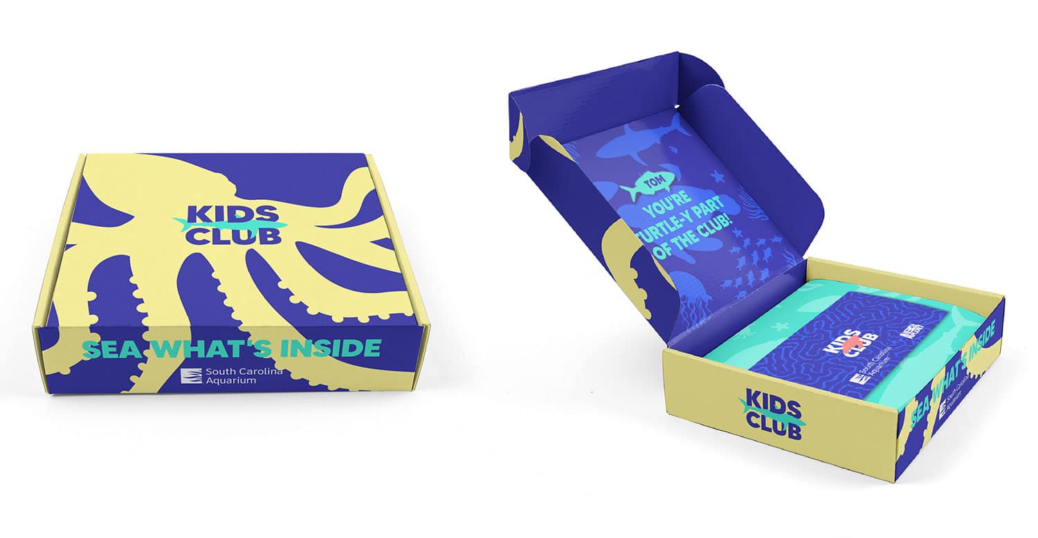
‘As it was first conceived, the Makeover Challenge served primarily as an academic exercise in package design; brands were strongly encouraged to choose a product that wasn’t slated for redesign in the near future. More recently, BXP has expanded the competition by looking at holistic brand design, in addition to package design, and sought opportunities for agency-competitors to give back by partnering with socially minded brands on projects with real-world deliverables. This year’s Makeover Challenge represents the BXP community’s most ambitious yet as the competitors team up with a nonprofit to help children create lifelong relationships with the ocean and its creatures. The ultimate goal is to kickstart a Kids Club for the South Carolina Aquarium that extends the aquarium’s ability to educate children both at the actual aquarium and in the children’s homes.

GOLD
Grupo imasD
As the competitor that took the top prize in this year’s Makeover Challenge, Grupo imasD was rewarded for its strategy-first approach that delved even deeper into the project, the brand and its goals than the aquarium’s initial-and-very-detailed creative brief. Read more, on page 11, about how the winning agency took learnings from this strategic design exercise to create a brand identity and designs that are cohesive and comprehensive.

Advertisement
SILVER
Lundmark Advertising + Design, LLC
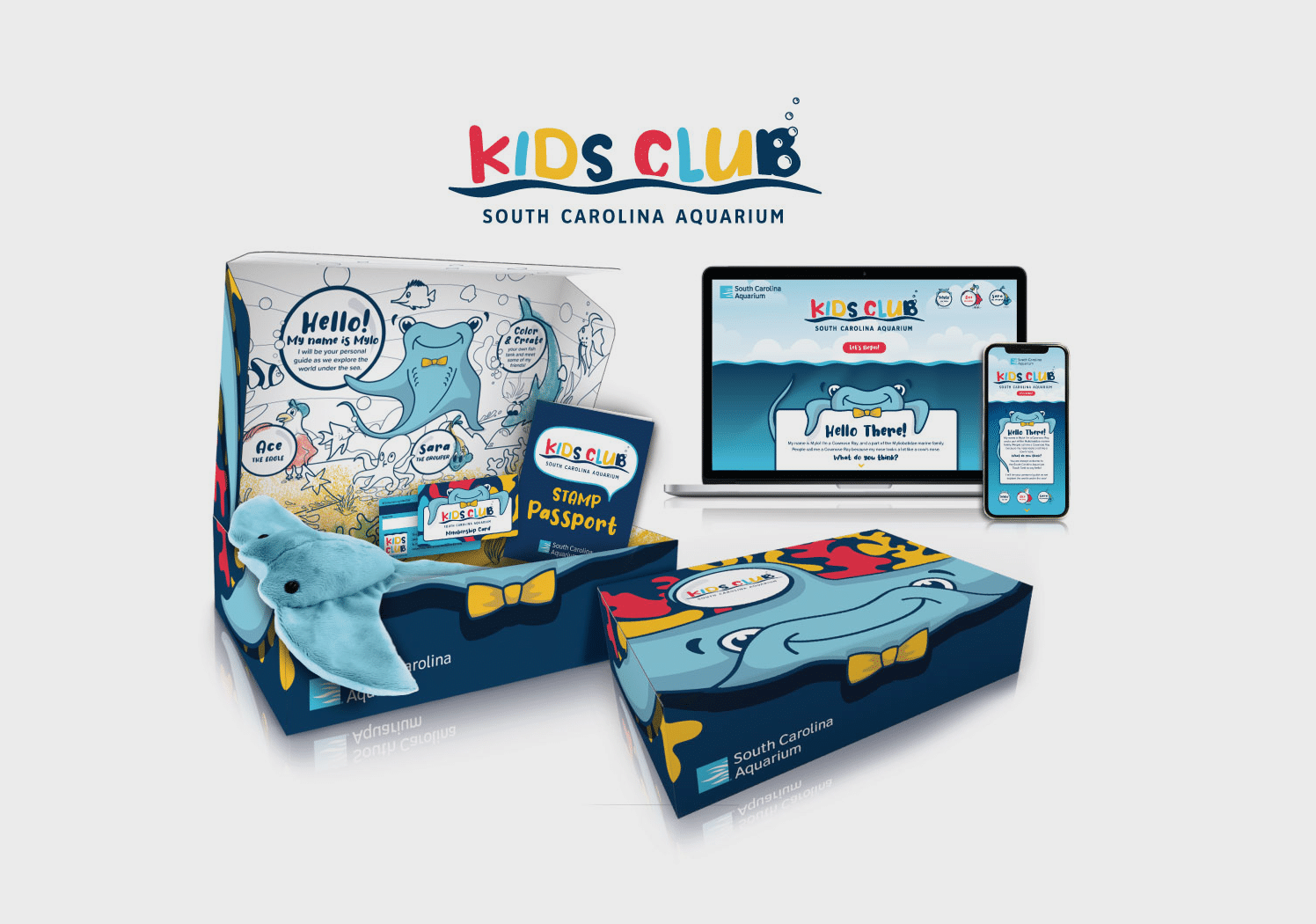
To make oceanography more accessible to kids, the Lundmark team leveraged its personal knowledge, as parents, of the target market. The result? An approach for all elements—from the Kids’ Club website to the stamp book and from the membership card to the shipper box—that is both fun and friendly, thanks, in part, to character-driven designs.
One such character is based on the aquarium’s very popular interactive stingray exhibit where kids can touch the water and interact with the animals known as myliobatidae. Understanding that the animal’s official name could be a challenge for many kids, Lundmark created the much more approachable character of Mylo, the stingray. Mylo and his friends serve as friendly virtual guides for children and their parents as families engage in the club’s educational experiences online, in-hand and in-person.
BRONZE
Cuticone Design
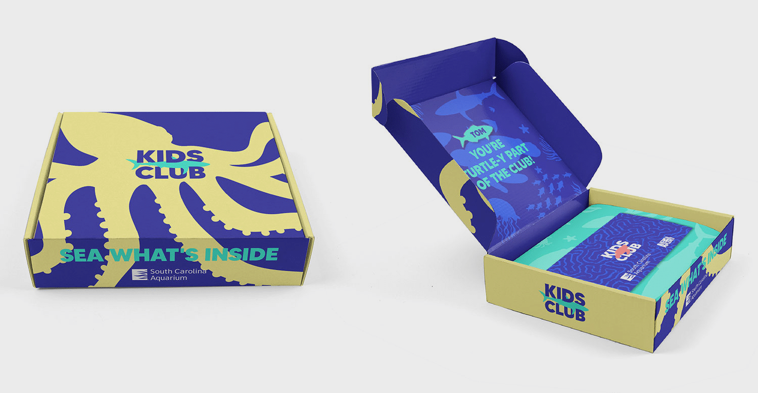
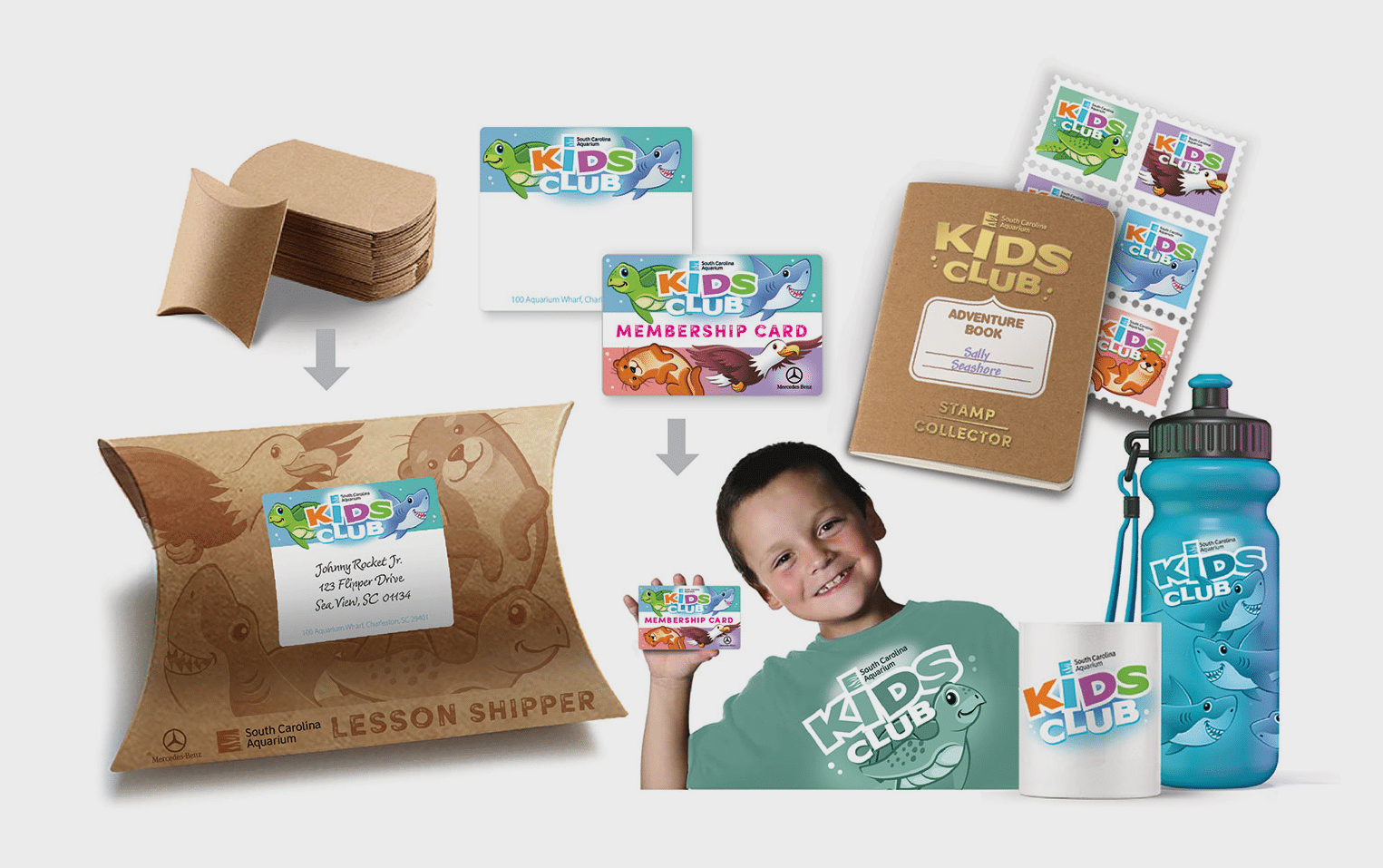
A high level of collaboration and interaction set Cuticone Design apart as the firm sought to understand the nonprofit brand as both a mission and a business. With a focus on both costs and efficacious design, Cuticone Design considered real-world challenges such as the expense and availability of materials in addition to paths to a quicker launch of the aquarium’s Kids Club.
Advertisement
Strategic decisions include a shipper design based on a pillow box, which is inexpensive and well aligned with the nonprofit’s eco-minded philosophy. The firm also based its character designs on animal plushes currently being sold by the aquarium—enabling the aquarium to speed the creation of membership kits by using existing inventory.
