Makeover Challenge
Gravity Branding & Design — 2019 MOC Strategy & Concept
Gravity Branding & Design | www.gravitydefyit.com
“My first meeting between just the Gravity team and me was amazing!” Bee Wild founder John Wright remarks. “It was obvious that they really took in what I said during the earlier meeting with all the teams. The Gravity team came to our private meeting with a guiding concept called, The Joy in The Journey, and it is based on my core brand traits, which are adventurous, bold and artisanal.”
Gravity’s director of operations Chuck Rovito explains, “At the beginning of the project, we focused hard on listening—listening to him, ‘listening’ to what was being said in Bee Wild’s creative brief, listening to what was happening in the honey category as a whole—and then using what we heard and saw to identify some potential spaces where his brand could evolve to live in. We identified these spaces, but let him as the client determine what is best for his brand.”
Chris Gajus, design director, Gravity, adds, “A big part of our creative process is being hyper collaborative—both within our teams and especially with our client. We made sure we were listening to John and continued to get his feedback all throughout the project, so we purposely set a goal to try to talk to John as often as we could so we could present our thoughts and findings along each step of the way.”
Rovito remarks, “For example with the brand statements, we shared those with John before we even got to the process of actually designing packaging. We wanted John to be on board for the entire journey, and it was inspiring to get feedback from John that our approach made a lot of sense—especially how we developed the brand story. We made sure that John was always in the mix as we were making decisions.”
This also shows strong adherence to the Makeover Challenge guidelines and philosophy, which, although a blue-sky contest. is set against real-world business parameters and showcases the power of brand design in a collaborative environment.
Wright is enamored of the brand statement: “We invite you to join us on an exciting quest unlike any other. The bees in our care create the beautifully created flavor notes that will energize your palate and awaken your love for culinary adventure. Our honey is Wild—harvested from the mountains of Northern Georgia, our curated range of infusions traverse the daring and spicy to the sweet and subtle. Come and adventure with us. It’s time to Bee Wild!”
Brand development director Barb Carlotta also notes that Gravity’s collaborative approach helps ensure that projects move forward swiftly, thus avoiding iteration for iteration’s sake. “It’s not only about having John part of the process and co-creating with us,” she explains. “Our collaboration and decision-making processes work hand-in-hand, so we can quickly diverge, then converge, process, and narrow to a strategy that the client feels confident and good about. We like to think about our creative process like a funnel, and we can move quickly and with an ever-increasing focus because we build with our clients.”
This approach, Gajus says, also helps get buy-in when a partner needs to challenge a client and push to do something that might initially make a client feel a bit uncomfortable. For example, when Gravity proposed changing the structure for Bee Wild’s primary packaging.
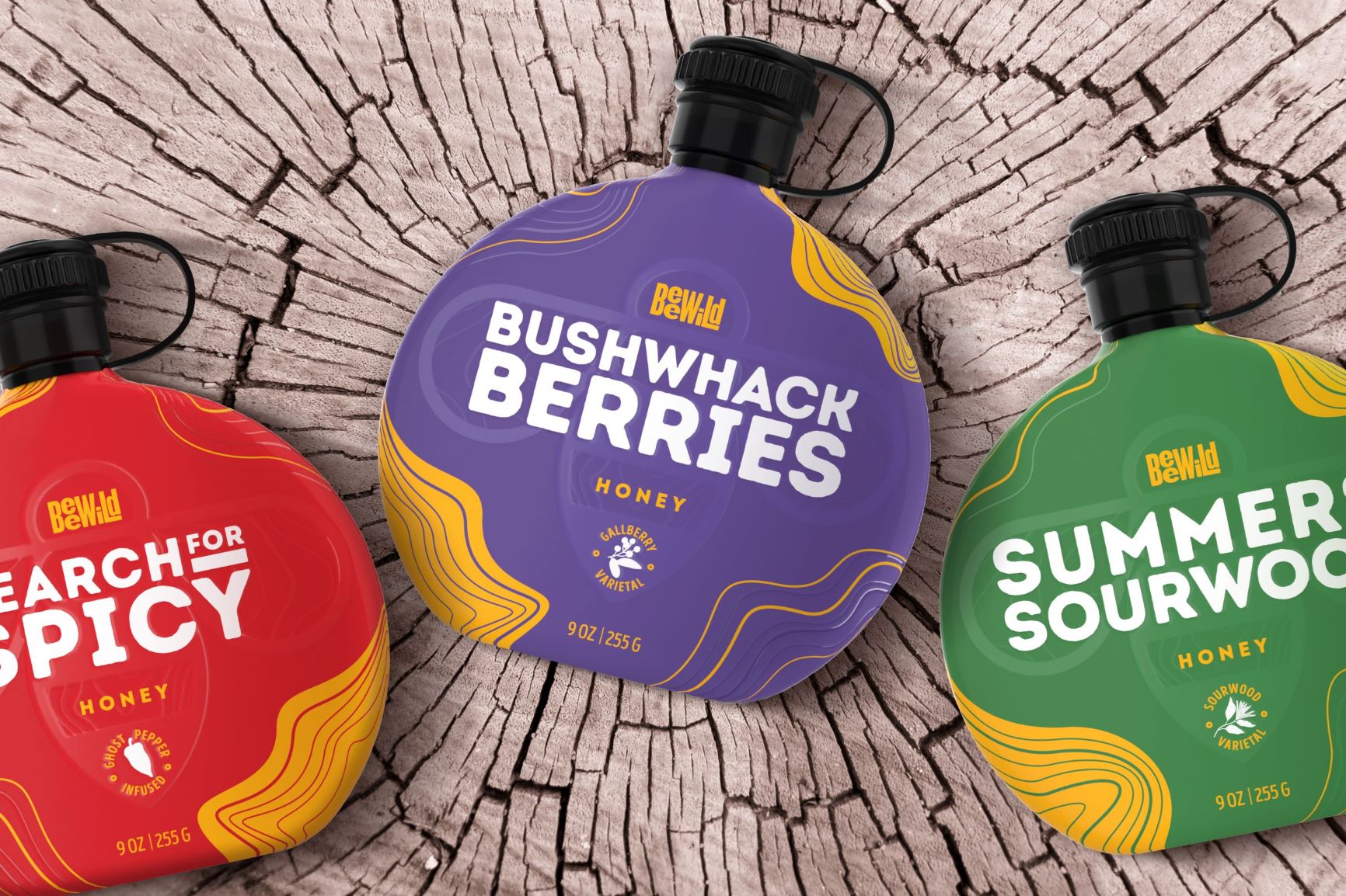
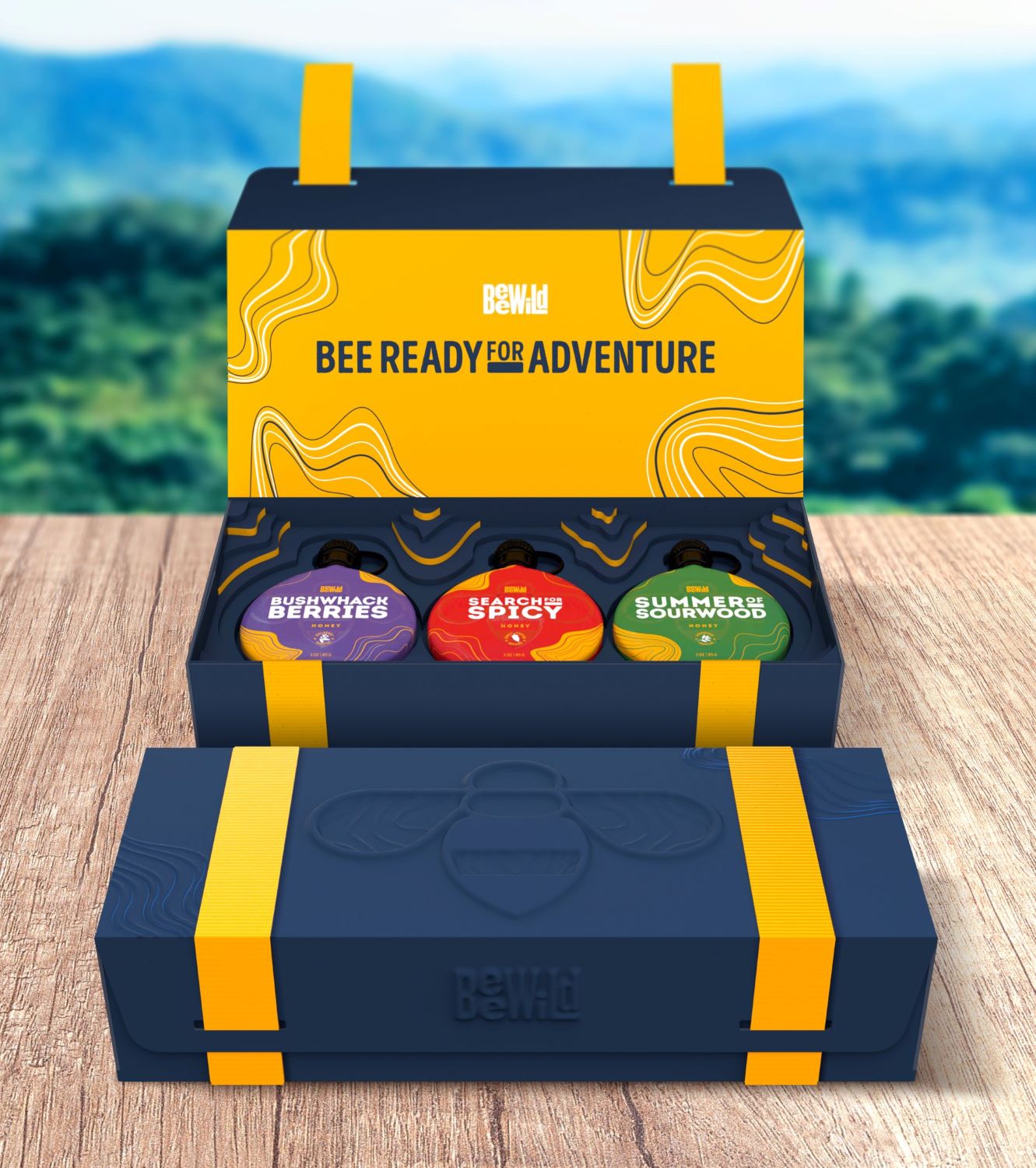
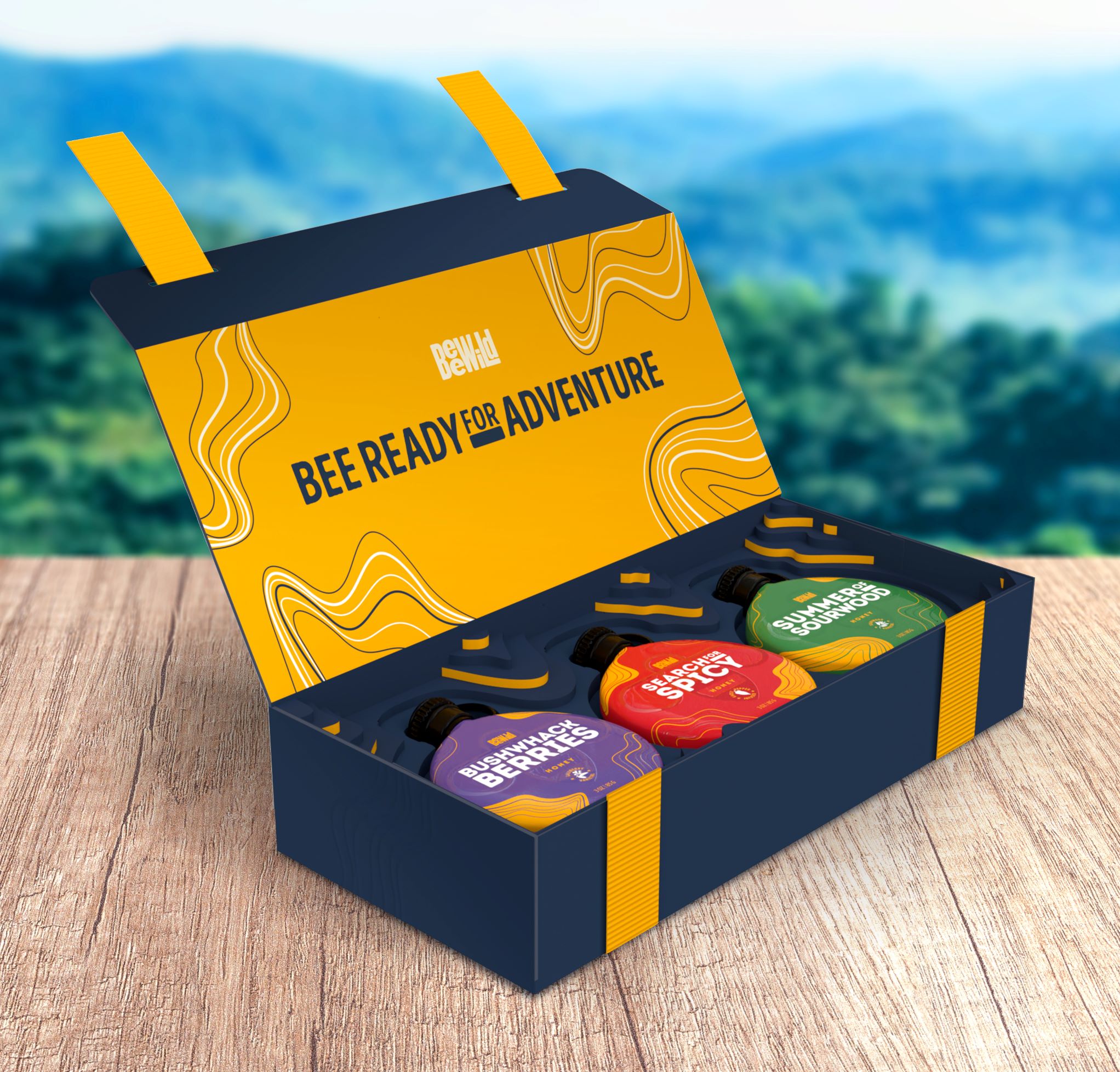
Wright believes that his current primary packaging for his 12-oz. honey—an upside bottle—delivers a superior brand experience for his customers, but when Gravity did its own customer experience research, it found problems with the glass jars for the 3-oz. ‘Tastes” and the 12-oz. plastic squeeze tottle. First, the combination of primary packages didn’t provide consistent branding across the structures, and second, consumers could no longer identify the honey varietal for the 3-oz. “tastes” once the jar lids were removed.
Gravity recommended that Bee Wild change its primary packaging to a canteen-shaped bottle for both honey sizes. The new packaging ensures that the varietal and brand information stays visible after opening and harkens back to the concept of “wild” by evoking the idea of supplies for a journey.
Because Gravity’s approach is so collaborative, Wright felt some ownership with the final concept chosen for the contest—even though it was a strong departure from his very popular tottle.
“We collaborated well on the canteen,” Wright explains. “The final concept still uses the same container shape and font as Gravity’s first concept, but the first version had more of this sort of gunmetal gray color to the canteen. And I told them, I love it, but it’s totally a man product.
“While I know that another team found that men are a rising demographic for honey, I can’t abandon my current client base, which are mostly women,” he says. “Together, we did a good job of editing Gravity’s primary packaging concept so it was more inclusive. Gravity even did three versions of the revision, so I could pick the version that resonated best with my brand.”
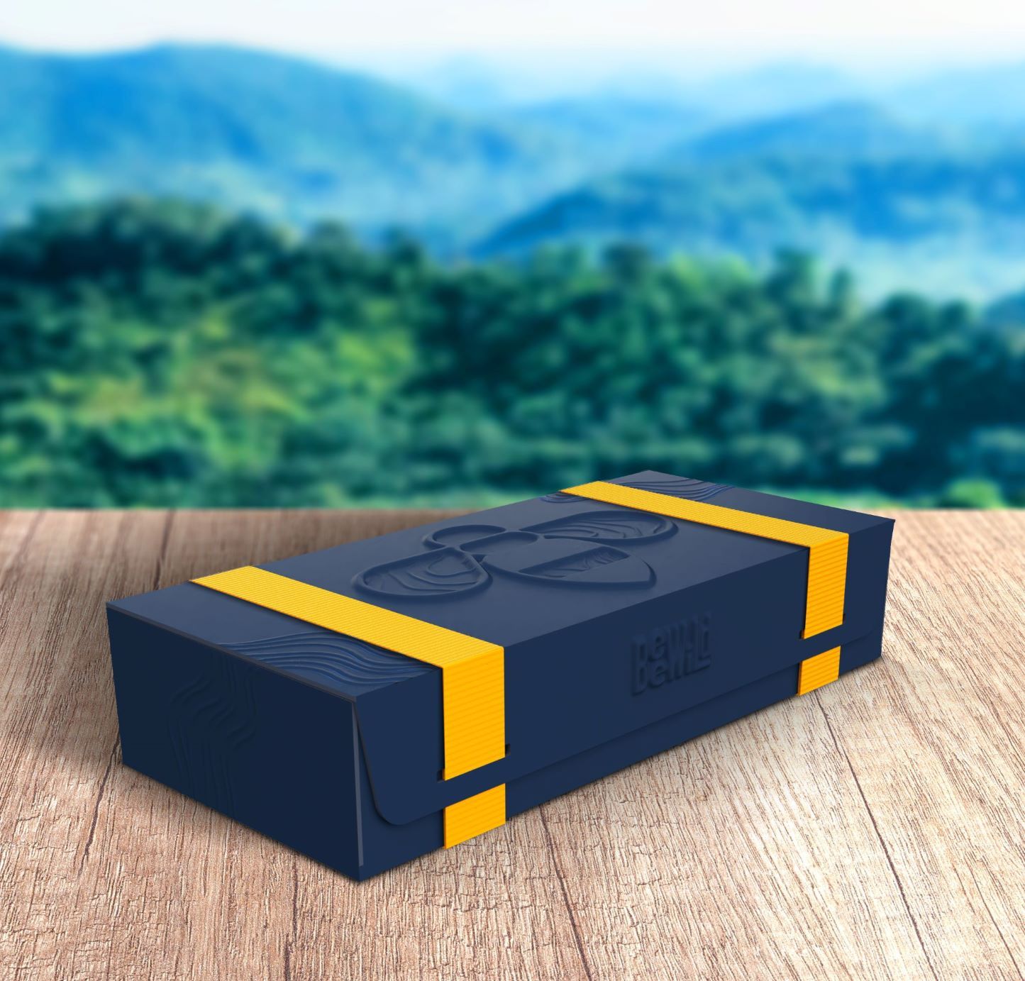
AdvertisementThe canteens go into a custom-made box designed for easy pack-out for both shipping and in-person distribution and delivers a superior brand experience. Instead of recommending dunnage, such as foam packing peanuts to protect the canteens during transport, Gravity designed the custom boxes to snugly fit the canteens. The interior box design is not only practical—no more flying packing peanuts upon unboxing—it also offered another opportunity to communicate the idea of terrain and a journey with the boxes’ intricate structural-and-visual interior design.
This smart product protection strategy is also an example of how the agency listened to the brand’s needs. “What I like about our process and the design we did for Bee Wild,” Gravity’s senior designer Ross Jacobs notes, “is that it’s a natural output of the process from the beginning. While the concept challenged John a lot, by working with him so collaboratively, our submitted concept almost feels like the inevitable point that links all the brand elements together.”
VOTE NOW
You can cast your vote now for Gravity’s concept at www.bxpmagazine.com/moc-2019. The agency with the most votes wins the challenge and will be featured in the December 2019 issue.
Branding with Ferocity – Thinking Like an Indie Brand
Get a better understanding on how to leverage new technologies to engage and delight shoppers, sustainability’s role in product and package design – being sustainable and premium are not mutually exclusive, plus best practices and tips for collaboration and how to launch new products and refresh existing product line-ups and brands.


BULLETINS
Get the most important news and business
ideas from BXP Magazine's news bulletin.