Food
Häagen-Dazs Updates Packaging with New Photography, Modified Logo
Firm behind the design strived to depict “modern luxury”
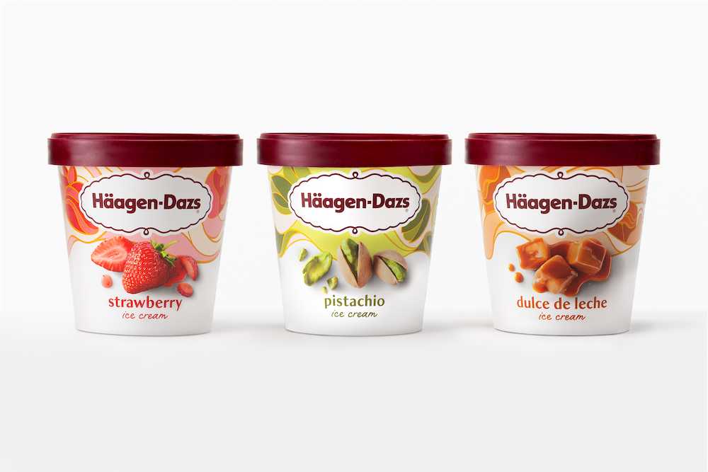
The Häagen-Dazs ice cream brand has unveiled an updated design of its packaging featuring modified typography and new ingredient photos.
Chase Design Group was tapped for the revamp, which called for refinement of the brand’s signature cartouche logo while retaining the prominent use of white and accents of gold and burgundy.
“We wanted to be sure that the typography also represented modern luxury, so we created a custom font named ‘Dazs’ that retains the classic vibe, but with a modern flair, and paired it with a hand-lettered script,” said Jon Arriaza, senior design director, Chase Design Group.
Additionally, the carton incorporates new ingredient photography, and an expanded color palette was used to refresh the background tapestry.
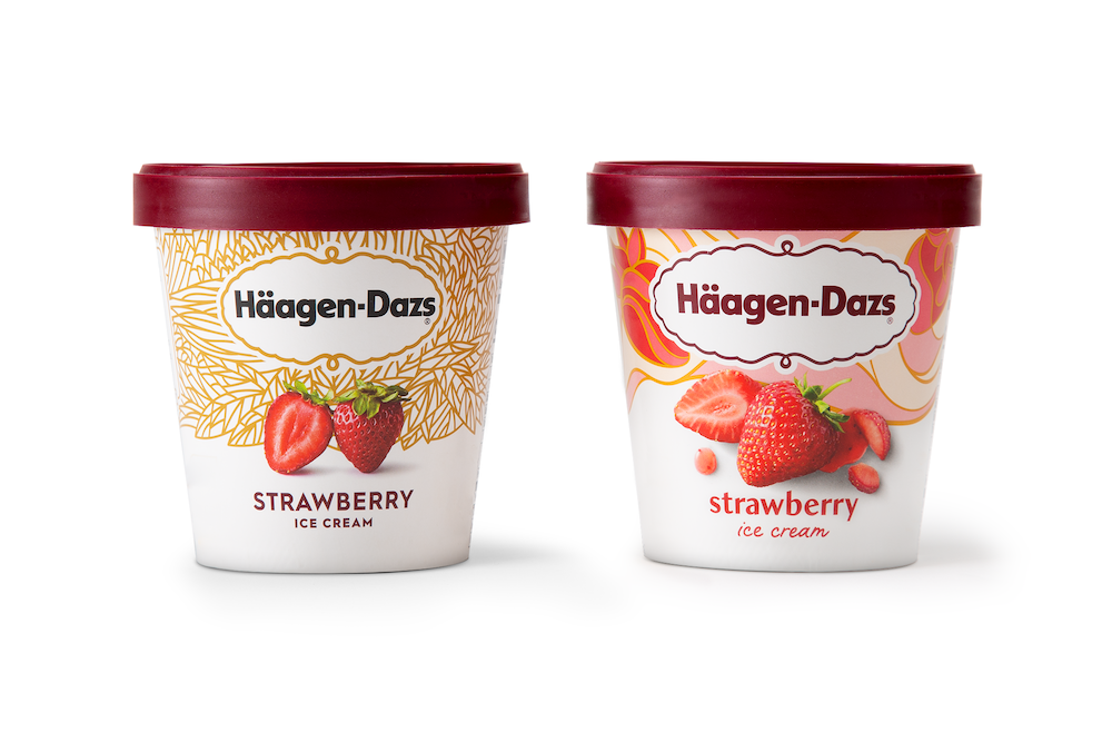
Before and after
Branding with Ferocity – Thinking Like an Indie Brand
Get a better understanding on how to leverage new technologies to engage and delight shoppers, sustainability’s role in product and package design – being sustainable and premium are not mutually exclusive, plus best practices and tips for collaboration and how to launch new products and refresh existing product line-ups and brands.


BULLETINS
Get the most important news and business
ideas from BXP Magazine's news bulletin.