Makeover Challenge
Makeover Challenge Concept Reveal: Designtology
Designtology
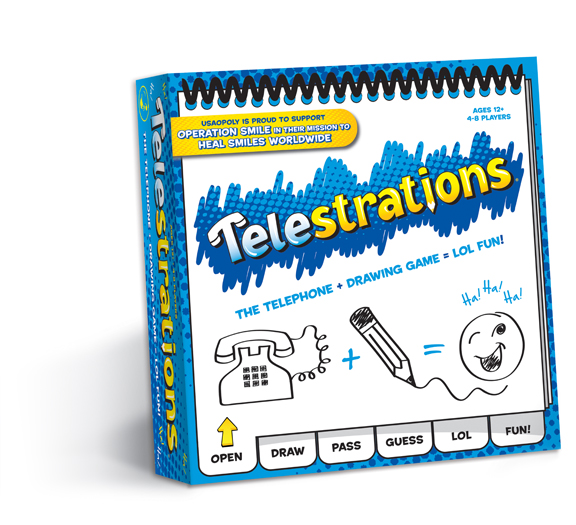
Communicating quickly on shelf is a primary tenet of Designtology’s concept for Telestrations, and that starts with the game logo. “Right away when I saw the logo, I knew I could improve it,” Kristi Miroballi, founder and creative director of Designtology, recalls. “I updated the logo so people immediately know the game is about the concept of a telephone and it’s an illustrating or drawing game. So I built upon the idea of ‘Tele’ being about the phone part by adding a phone receiver on part of the T and ‘strations’ meaning illustrations by using a pencil for the I.”
The concept resonated with Jackie Miserany, marketing manager at USAopoly. “I liked Designtology’s treatment with the logo, which is a clever take on the name,” Miserany remarks. “It’s practical and playful.”
The icons also serve the purpose of breaking up a 13-character brand name. “Telestrations is a long word,” Miroballi explains. “Using icons within the brand name makes it more readable, enhancing the colors and making a new font choice enabled me to update the brand mark, make it a little more fun but still be very recognizable. It also enables the brand name to communicate well even when it’s not paired with its tagline.
Keeping the packaging recognizable was important to Miroballi because the game has 10 years of brand equity. “As a customer, I know when a package completely changes its color or look, I can pass by it on the shelf because I have a specific image in my head. I wanted to make sure that Telestrations brand fans can easily find the product on shelf.” She notes that part of a strong redesign is knowing what features are already working and being disciplined enough not to “mess” with those elements.
In keeping with this philosophy, Designtology’s final concept built upon many of the key features of the existing packaging versus replacing those features. The logo and tagline have been moved slightly to allow for room for the charitable image, but still primarily occupies the top half of the box and the sketchpad tab design was kept at the bottom of the package. But like the logo, the tabs have been enhanced.
AdvertisementOn Telestrations’ current packaging, the tabs are a flat graphic representation. In Designtology’s version, the first tab lifts up to reveal completely new storytelling panels. Erin Steele, product manager and producer at USAopoly remarks, “The fold-over tab/flap over the front of the box is a nice touch. It allows for more graphic real estate on the underside of the flap and underneath the flap that as well.”
The additional real estate explains the game play for those new to the brand and introduces modern full-color photography into the design, while creating intrigue in the retail environment. Other shoppers in the game aisle would observe a potential customer actively engaging with the packaging and would want to interact with the package as well.
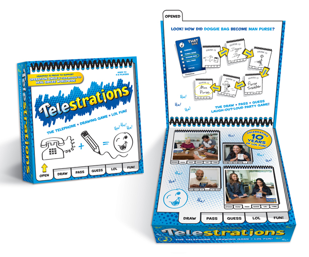 When recommending the addition of this structural element to the Telestrations packaging, Designtology carefully considered the financial impacts. Miroballi explains, “A big part of the research and thought process was understanding the costs of adding complexity to the packaging,” she says. “We knew that maybe doing a window, a flap and a die cut is probably too much.”
She also advised the USAopoly team on the best way to implement the flap design—noting that a magnet is fun, but expensive. Pulling from her experience in the toy and game industry, Miroballi instead recommended a Velcro dot. “It’s easy to open and close but doesn’t have the expense of magnets,” she explains.
Miroballi also recommended that the special-edition messaging not be on the packaging itself. Instead, she suggested that the messaging be designed so it can be printed on a sticker or the overwrap so retailers would not have to return the game to USAopoly for repackaging when the one-year contract with Operation Smile closes.
But she made sure that the charitable message was given prime real estate in the overall design, as it is important to Operation Smile, USAopoly, Designtology and Miroballi herself. “While the charity did change from supporting cancer research to Operation Smile, I still feel the charity part of this project is so important,” she says. “Any charity is important, but especially if it’s helping kids. What’s cool about the tie in with Telestrations is that the brand team always talks about [how] laughter is healing and that’s basically what Operation Smile is about—healing kids so they can smile again.”![]()
VOTE NOW
You can cast your vote now for Designtology’s concept at www.bxpmagazine.com/moc-2018. The agency with the most votes wins the challenge and will be featured in the 2018 Annual Awards issue and invited to the 2019 BXP Live conference.
Branding with Ferocity – Thinking Like an Indie Brand
Get a better understanding on how to leverage new technologies to engage and delight shoppers, sustainability’s role in product and package design – being sustainable and premium are not mutually exclusive, plus best practices and tips for collaboration and how to launch new products and refresh existing product line-ups and brands.


BULLETINS
Get the most important news and business
ideas from BXP Magazine's news bulletin.