Package Design
MegaFood creates excitment with debut of gummy vitamins
Published
6 years agoon
By
Linda Casey
How do you branch out of your product line without alienating your current customers? That question was at the forefront when MegaFood, maker of natural supplements, decided to create its first line of gummy vitamins. It was clear from the beginning that transparency was key to a successful marketing and branding campaign. Instead of a product development clouded in secrecy, MegaFood decided to take the opposite route and build momentum by chronicling the complete project. The resulting four gummy vitamins were introduced at this year’s Natural Products Expo West and won an award for Best New Delivery Method.
Long road to success
Transparency has been core at MegaFood since the company launched its Big T Transparency initiative in 2015. The main goal was to increase trust for the supplement industry by giving customers insight into all aspects of the manufacturing processes at MegaFood, from ingredient sourcing to product testing. The gummy vitamins were the first products that were followed throughout the development process, a project aptly named Gummy Bare All. It included a customer liaison panel, a blog, Facebook live updates and a virtual advisory panel.
“The MegaFood ‘Gummy Bare All’ initiative was intended to chronicle the complete development process of this new product—from concept to finish, including successes, challenges and even failures,” says Carol Billlings, director of marketing at MegaFood. “Additionally, customers had the opportunity to not only follow in real-time the evolution of the products from conception to market, but were able to directly weigh in on key product decisions along the way.”
Fresh and familiar
MegaFood also enlisted Hughes BrandMix to redesign the product packaging.
“Because the brand is already pretty established, it was important that not only did we communicate the new fun aspect of the gummy vitamins, and how they can be potent and relevant, but also to stay within the field of the MegaFood brand and what consumers liked about it,” says Courtney Hickey, account manager at Hughes BrandMix.
Billings adds, “We worked with Hughes BrandMix to help us identify a product label for these new gummy vitamins. Eighteen label designs were originally created and each of them tested within consumer focus groups and at retail shelf. Our gummy jar is much smaller relative to other gummy products at shelf. We knew that we wanted a colorful bright label to catch the consumer’s eye and convey all the real, fresh foods in the product. Consumer feedback helped us narrow down the label design to what you now see—consumers shared that they still felt connected to the MegaFood brand (despite the creative departure from the traditional yellow label) and were compelled to purchase the product based on the design.”.
Delivering all the feels
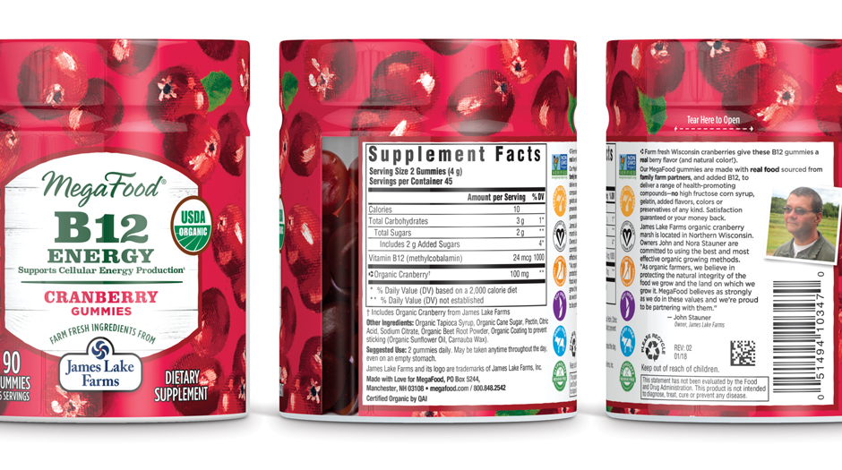
The bottom of the jar is also transparent, to make it clear that the content are gummies and not tablets. Most of the jar, however, is covered with colorful illustrations of the plant ingredient (ginger, citrus, mixed fruits and cranberries). These vivid images are designed to evoke feelings of farming and nature and were created based on concepts introduced during a Phase 1 presentation with MegaFood. Hughes BrandMix intentionally wanted to avoid photography, because it can appear more mainstream and modern than the rustic feel MegaFood was looking for.
“The illustrator calls herself impressionistic,” says Jamie Teska, design director at Hughes BrandMix. “She is an oil painter. She actually bought the ingredients, put up a still life, painted it and mailed us the canvas. We imported it into the computer and took it from there. It’s almost like Monet did it, artful and gestural. “
“Even though [the illustrations] are impressionistic, they are not necessarily moody,” says Greg Martin, creative director at Hughes BrandMix. “We wanted vibrant colors because this is a healthy product. Brighter colors can evoke that wellness and healthy feeling. They gravitated towards a balance between showing the actual ingredients and giving it some liveliness as well as taste appeal and flavor.”
On top of the illustrations is a white label featuring the MegaFood logotype and other essential product information. The name of the vitamin appears larger than both the flavor and the delivery method because customer feedback during the Gummy Bare All project revealed that to be the most important factor to consumers.
Hughes BrandMix introduced a shrink wrap to expand the real estate on the label and emphasize MegaFood’s commitment to farm-fresh, organic ingredients. Because the core ingredient of each supplement originates from a specific farm, each jar displays that farm’s logotype prominently on the front label. The back label features a description of that farm and a picture of a farmer.

The partnership with the farms also is highlighted on MegaFood’s website, social media channels and marketing material. For example, James Lake Farms, which makes the cranberries in the B12 vitamins, appears in a YouTube video on MegaFood’s website. The two companies also have supported the Three Lakes Community Foundation, a philanthropic organization.
“As organic farmers, we believe in protecting the natural integrity of the food we grow and the land on which we grow it,” says John Stauner, owner of James Lake Farms. “MegaFood believes as strongly as we do in these values. We provide a quality ingredient for a great line of MegaFood products that can make a difference in someone’s life. By working with MegaFood we connect with that person and promote the health aspects of cranberries.”
Advertisement
For more information, visit
MegaFood, www.megafood.com
Hughes BrandMix, www.hughesbrandmix.com
James Lake Farms, www.facebook.com/jameslakefarms

SPONSORED VIDEO
Branding with Ferocity – Thinking Like an Indie Brand
Get a better understanding on how to leverage new technologies to engage and delight shoppers, sustainability’s role in product and package design – being sustainable and premium are not mutually exclusive, plus best practices and tips for collaboration and how to launch new products and refresh existing product line-ups and brands.
You may like
Advertisement
Subscribe

BULLETINS
Get the most important news and business
ideas from BXP Magazine's news bulletin.
Advertisement


