Morton Salt, one of America’s favorite and most enduring brands, has debuted a fresh new look on packaging to bring more flavor to its entire line-up of retail products. The eye-catchingly bold and contemporary design refreshes the iconic brand that consumers have known and loved for generations, while making its products more shoppable in today’s dynamic digital and in-store environment.
The stylish new design stretches across Morton’s entire retail portfolio, spanning both culinary and home care products—from Morton® Kosher Salt, Sea Salt and Himalayan Pink Salt to Morton® Water Softener Salt, Pool Salt, Ice Melt products and more.
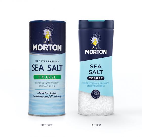
Morton partnered with creative agency, Chase Design Group, to develop a premium visual design that showcases brand colors, striking geometric angles and sans serif type to help make the packaging easier for consumers to navigate on shelf. The design system is anchored by the beloved Morton Salt Girl and a quality seal that highlights the company’s origins, which date back to 1848. In addition, Morton’s new packaging graphics feature more educational content about salt usage and carry the “How 2 Recycle” label to help consumers properly recycle its packaging.
As we continue to expand our brand and product portfolio, it is imperative to evolve our packaging for the future with more modern cues and a design system that helps consumers understand the variety, benefits, and versatility we have to offer across our culinary and home care categories,” says Denise Lauer, CMO, Morton Salt Inc.
Chase Design Group worked with the Morton team to combine Morton’s iconic brand assets with clean typography and bold graphic shapes to create a design system that celebrates Morton’s rich history while feeling relevant to today’s consumers.
For Morton’s comprehensive line of culinary salts, it was important to create a design system that would clearly communicate the differences between product offerings. “This was achieved with a mix of interchangeable elements including transparent windows, usage occasion photography, color coding, iconography and typography,” says Clark Goolsby, chief creative officer, Chase Design Group, New York. For its home care line, the Morton brand was given greater prominence while design elements were simplified across the full range of packaging structures.
Advertisement
Morton Adds a Dash of Augmented Reality to New Packaging
To support the rollout of its new packaging look, Morton will launch an integrated marketing campaign which includes in-store, digital and social media activations, as well as PR and influencer programs. In addition, Morton is releasing a new augmented reality experience that can be activated on select culinary salts featuring the new packaging design. The experience will enable consumers to engage with the Morton brand in several fun and educational ways.
“As consumers continue to spend more time at home cooking and bring new digital tools and technology into the kitchen, this is the perfect time to deliver an all-new experience with the Morton brand,” Lauer added. “Consumers can simply scan the QR code on specially marked Morton culinary products, then choose from various augmented reality experiences, including interactions with our new packaging, recipe content and the Morton Salt Girl.”
And in keeping with Morton Salt’s mission to Erase Food Waste, the augmented reality experience will provide recipe inspiration based on ingredients that consumers already have on hand at home, so they can make the most of mealtime with Morton.
Morton is already rolling out its new packaging design at retailers across the country. Consumers can find the new look on their favorite home care products in-store and online now. Morton’s updated culinary products will continue to rollout through the end of the year. Look for Morton culinary products with the QR code tags to activate the augmented reality experience launching later this year.