Catching a Wave
Beach St. Vodka Cocktail depicts summer imagery to promote an authentic drinking experience.
BETWEEN 2018 AND 2020, sales of alcoholic hard seltzers jumped from approximately $500 million to more than $4 billion, according to NielsenIQ. When a sector like this catches fire, it provides both an opportunity and a challenge to introduce a new product.
The packaging needs to convey the brand message and taste experience, quickly and indelibly. Enter Beach St. Vodka Cocktail, a new hard seltzer from Christopher Michael Brands.
According to Stephen Goodridge, the brand’s co-founder, Christopher Michael Brands wanted to capitalize on two trends in the alcohol beverage space. First, the move toward premiumization. Second, a stronger focus on health and wellness.
“We’re seeing that consumers are drinking less, but they’re drinking better,” he says. “It’s about quality over quantity now. Consumers are also obsessing over ingredients, and so they’re checking labels very carefully. They want authentic products and a good drinking experience.”
To that end, Beach St. is truly vodka-based, not a treated beer base. Starting with a proprietary vodka, the mixture is filtered with select activated charcoal and then combined with carbonated water, fruit zest and only one gram of real cane sugar—and no artificial sweeteners, preservatives, gluten or colors.
“We know that consumers connect with brands at an emotional level and so we also wanted to evoke those kinds of emotions associated with relaxation, chilling and that cool California vibe,” Goodridge says. “This is really sort of a West Coast answer to East Coast hard seltzers.”
The brand turned to Los Angeles-based Chase Design to develop that cool, summery California vibe for the Beach St. can and case design.
Advertisement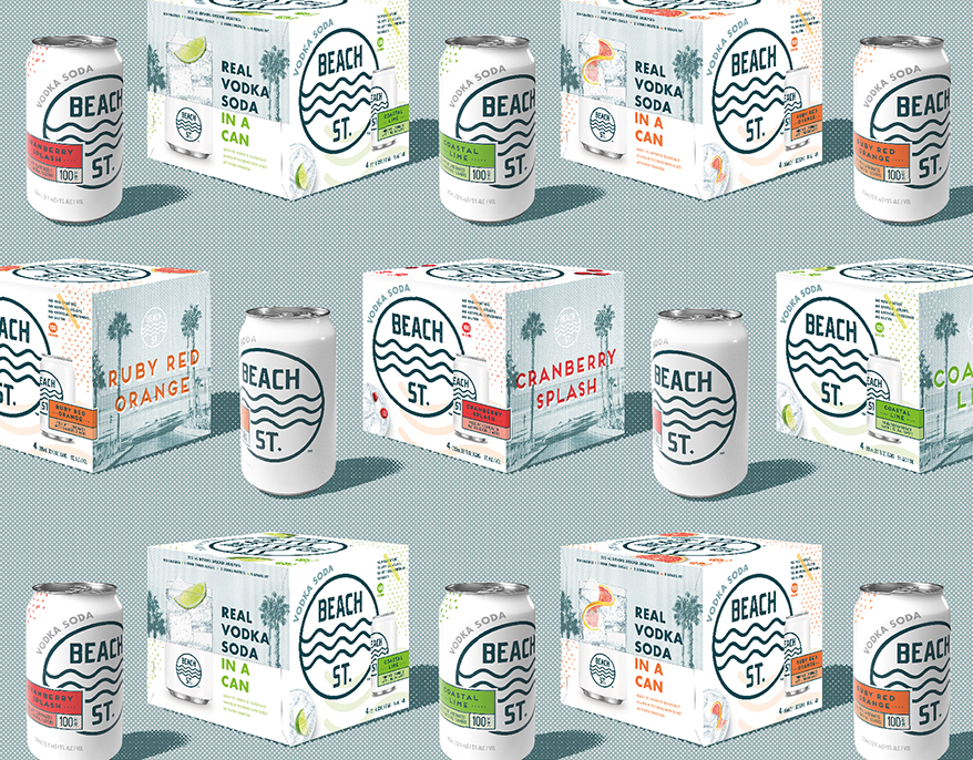
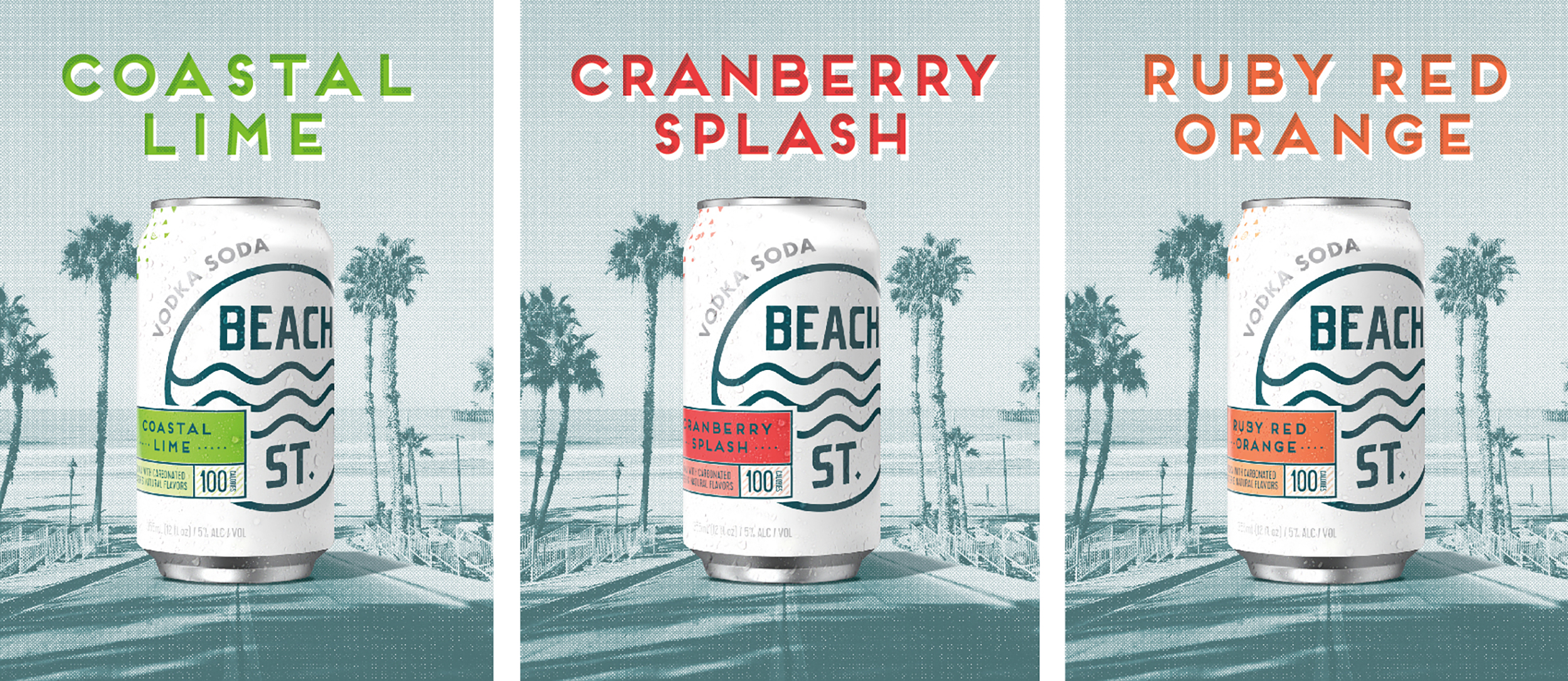
Images, logo, color and design work together seamlessly to suggest summer days, good times and relaxing vibes.
For the logo, senior art director Dave Carlino designed a parallel three-line wave graphic and used a clean, contemporary sans serif font reminiscent of old-style beach signage that would be easily recognizable and evocative even to landlocked consumers. “We wanted to portray good times with friends anywhere,” Carlino says. “Even if you don’t live in California, your Beach St. could be anywhere you are.”
Carlino chose blue for the logo to conjure up the ocean, while the unblemished white background suggests the product’s light flavor and natural ingredients. Supporting graphics reinforced the cool California beach theme. On both the cans and case, Carlino designed a pattern indicative of board shorts—swimwear worn in surfing or other board-centric sports.
The boxes have an up/down shot of a cocktail with a different piece of fruit on each to represent the brand’s four flavors. Carlino designed each panel of the outer box to stand out.
Advertisement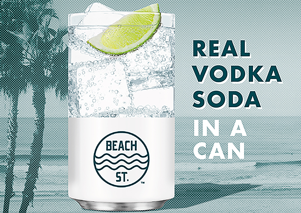
The uncluttered design and bold lettering instantly convey the brand’s character.
The front panel has the logo, cocktail glass and can. The top of the box has an appealing assortment of refreshing, summery fruit with water droplets. The right side has the Beach St. image with the flavor in big letters. On the left, Carlino created a split-pack image that works with the flap of the box: The top half shows a cocktail glass filled with fruit, with the bottom half of the Beach St. can below. “Vodka soda” and “real vodka soda in a can” are boldly lettered.
According to Carlino, the goal became to make the complete package design—not just the logo— telegraphic. It should stop shoppers and make them think, “Wow—this is a real cocktail in a can.”
Graphic Packaging International worked with Chase to make the artwork press-friendly. According to Graphic Packaging’s lead pre-press customer service specialist Karen Moffett, this involved placing the artwork in the correct Graphic Packaging dieline, recreating the UPC for scanability, and creating a 3D render to show the brand how the graphics would
appear on the folded box.
“The packaging was printed on beverage grade solid unbleached sulfate AquaKote paperboard,” Moffett says. “AquaKote Coated Folding Carton Board is a high wet-strength sheet used primarily for beverage packaging applications. The packaging was printed six colors conventional offset with an aqueous coating.”
Beach St. originally went out to market just as the pandemic started and had to abort its plans, so it’s premature to draw conclusions. But even with an abbreviated launch, feedback seems to be very positive.
“We’ve seen great velocities and pulls off the shelf,” says JP Glunz, vice president of marketing for Louis Glunz Beers of Chicago, a Beach St. distributor. “The packaging definitely helps with its billboard effect on shelf.”
Over the last 18 months, Glunz says, more shelf space has been designated for this category of seltzers, with some stores expanding from 4- to 16-ft. sections. He explains, “When you put brands next to each other, their packages create that beautiful space on the shelf that attracts shoppers.”
AdvertisementThe wording and images reinforce the brand’s authenticity and premium quality.
Branding with Ferocity – Thinking Like an Indie Brand
Get a better understanding on how to leverage new technologies to engage and delight shoppers, sustainability’s role in product and package design – being sustainable and premium are not mutually exclusive, plus best practices and tips for collaboration and how to launch new products and refresh existing product line-ups and brands.


BULLETINS
Get the most important news and business
ideas from BXP Magazine's news bulletin.