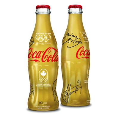
Beverage
Package designs for natural, organic foods and more
Relevant Appeal
Global greatness with a Canadian twist.
When it comes to brand recognition, Cola-Cola has managed to consistently maintain the delicate but powerful balance of a brand with both global presence and local relevance. Working with creative partner, Perennial Design (www.perennialinc.com), the brand created a limited-edition bottle that uses cold foil material versus traditional gold inks that conveys the concept of award-wining quality and celebrated the participation of Coca-Cola in the Winter Olympics, early this year.
Healthy Approach
Organic food line attracts shoppers with a playful look. 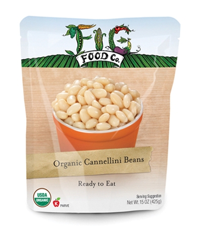
Fig Food Company, an organic and natural food purveyor offering ready-to-eat varieties of beans and condensed soups available at Whole Foods and other high-end grocers, takes a playful approach to healthy eating with retort pouches by Sandstrom Partners (sandstrompartners.com). “The packaging stands out,” Fig Food Company founder, Joel Henry comments, “because there’s is a certain understated simplicity that makes it so appealing.” Jack Peterson, president at Sandstrom Partners, adds, “The design is very approachable, yet very natural looking and not overly corporate. If the logo were in isolation without a product shot you would say, ‘That is a wholesome and natural brand.’”
Advertisement
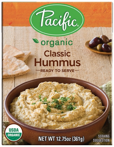 Growing Family
Photography-first design strategy creates shelf-appeal for the newest debut in organic foods line.
Pacific Foods expands its shelf-stable product line, introducing organic hummus and salsa con queso, in Tetra (www.tetrapak.com) Recart BPA-free cartons (www.tetrapak.com). In an attempt to deliver the same or greater “appetite appeal” of competing hummus and salsa con queso products sold in transparent glass or plastic packaging, Pacific Foods partnered with Polara Studio (polarastudio.com) on the food photography. “We took great care with the photos, to ensure that the bowls are all shown at the same angle,” Russ Perkins, graphic designer at Pacific Foods, explains. The tops of the cartons feature different color-coded textured bars, corresponding with each flavor. Continuing with the color coded distinguisher, different colored bowls, napkins and garnishes are used per variety.
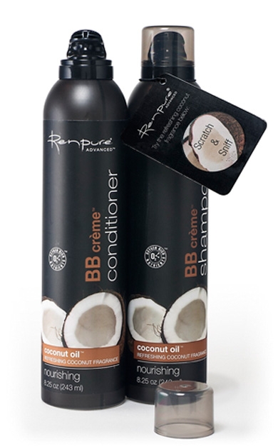
Black to Basics
Shampoo and conditioner line exudes elegance.
The poise and sophistication associated with black in the health and beauty sector influenced hair care purveyor Renpure’s Advanced BB Crème Shampoo and Conditioner package design. The haircare brand turned to Aptar Beauty + Home (www.aptar.com) for a pressurized packaging solution for the oxygen-rich shampoo and conditioner formulas with argan, coconut and palm oils.
The 8.25 oz. black aluminum bottles are manufactured by Montebello Packaging (montebellopkg.com) and use a bag-on-valve actuator and Allegra over-cap made by Aptar. The pressure-sensitive labels have a black background with a neutral color palette of white and brown. A scratch-and-sniff hangtag rest on the neck of each bottle, enabling the shopper to smell the product fragrance before purchase.
Branding with Ferocity – Thinking Like an Indie Brand
Get a better understanding on how to leverage new technologies to engage and delight shoppers, sustainability’s role in product and package design – being sustainable and premium are not mutually exclusive, plus best practices and tips for collaboration and how to launch new products and refresh existing product line-ups and brands.


BULLETINS
Get the most important news and business
ideas from BXP Magazine's news bulletin.