Chicago menswear brand Public Rec reveals a new brand identity, with strategic support from branding and creative agency Studio.Build and writing agency Reed Words.
Public Rec’s new visual identity and voice are as sharp and elegant as its apparel, creating a strong foundation for growth.
Launched through a 2015 Kickstarter campaign set up by former investment banker Zach Goldstein, Public Rec’s first product was the All Day Every Day Pant, described as ‘more stylish than sweatpants, more comfortable than jeans’. The ADED Pant proved a huge success and was soon followed by new additions to Public Rec’s smart leisurewear range, which now includes nine core clothing products and a growing selection of accessories.
This is a brand that has grown fast, fueled by the passion and energy of its founder. Now Goldstein is ready to take Public Rec to the next level–and the new brand and voice gives him the tools to do just that.
Clean, simple, elevated
Nicky Place, co-founder and director at Studio.Build, says: “The Public Rec brand has always been an expression of its founder’s personality. Zach is very clear, very driven; he knows success but he’s humble too. He is hugely fastidious, with an incredible eye for detail. All of these traits are also characteristics of Public Rec apparel. It’s clean, it’s simple but it’s so well-considered and put together with such care and attention that it’s elevated above other leisurewear.
Advertisement
“Public Rec already had a clear, straightforward personality but most of it was still in Zach’s head. Our job was to formalise and refine the brand so other people could articulate it as well as Zach, giving Public Rec the platform for growth that it needed.”
Simplicity is everything
Working closely together, the two agencies gave Public Rec an authentic, distinctive strategy, identity and voice.
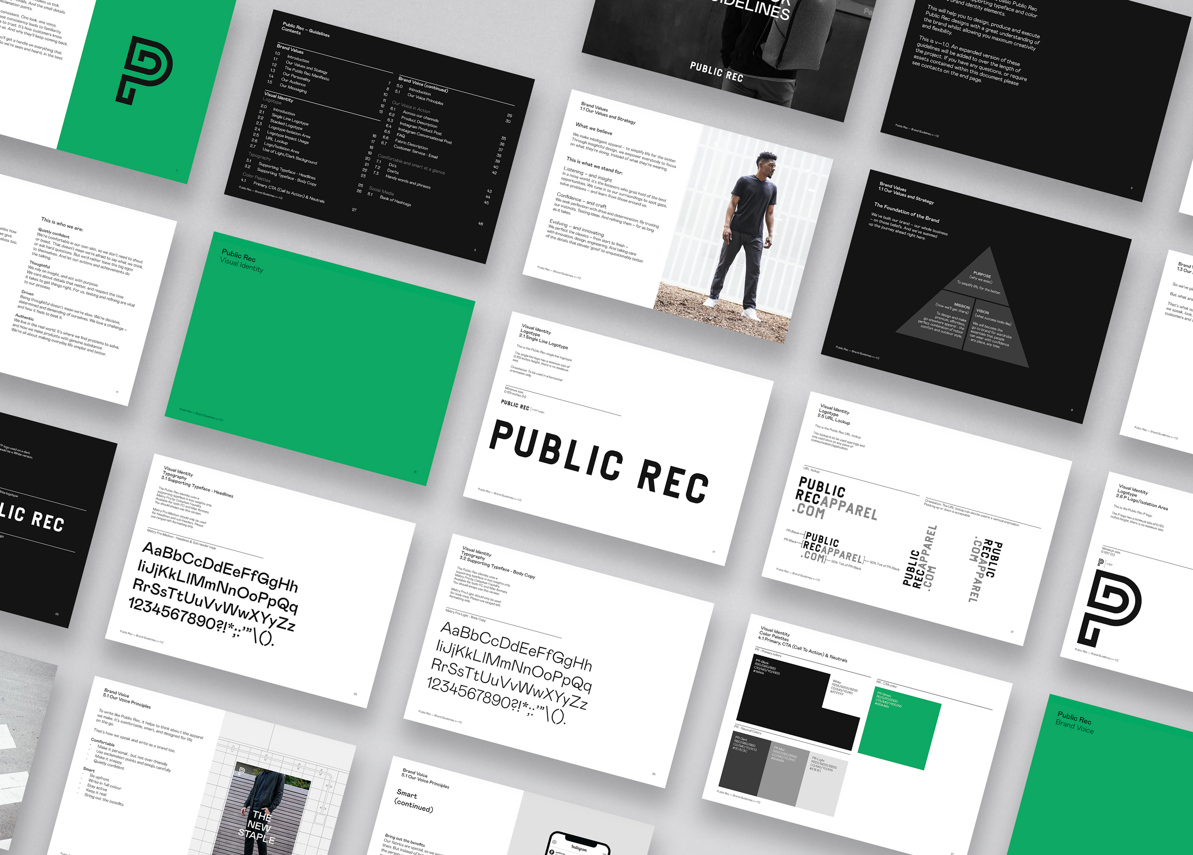
The new visual identity created by Studio.Build covers everything from Public Rec’s logo to typefaces and color palettes, the style of photography, and how it uses imagery. Everything is elegant, pared back and simplified. Place explains: “Having a simple visual system works so well for a brand like Public Rec – but the simpler the system is, the more perfectly it must be executed. Why use 20 colors when you only need three?
“That means really going deep in the initial research phase, carefully considering the solution and then executing fastidiously, paring back and finessing everything as much as possible.”
Finding a voice
Advertisement
Working closely with Studio.Build, Reed Words shaped the brand’s ‘leisurewear for everywhere’ philosophy into a clear, simple strategy, tone of voice and central purpose–‘To simplify life, for the better’. This gave Public Rec a yardstick for everything it does and each new product it creates.
Reed Words also developed a manifesto, tagline and belief statements that can be mixed and matched on advertising, social media, packaging and elsewhere.
Studio.Build captured the new look and voice in a brand book and guidelines–creating a toolkit that ensures Public Rec is always seen and heard in the best way possible. The new guidelines are already being used by Public Rec on everything from descriptions of its bespoke fabrics to its new website, also written by Reed Words.
Free-flowing collaboration
Writer Jade Barrett of Reed Words says: “This project is a great example of open-minded, free-flowing collaboration between two creative agencies and an inspiring client. Zach knew he needed a platform for growth but wasn’t sure how to create it. Now he is.
“There are genuine, clear-cut principles behind everything Public Rec does–the brand’s values are really clear and there’s an authenticity about Zach and his brand that’s really positive and infectious.”
Advertisement
Nicky Place says: “We’re proud that Zach now sees us as brand guardians. To do what he wanted, we had to take everything back to the essentials, getting to know him and his hopes and dreams for the brand really thoroughly.
“When we started it was just Zach. We always really enjoy working with people from the start and seeing the value we add to their business. You get a real sense of how what you’re doing helps move things forward in a measurable way.”
Zach Goldstein says: “This has been an incredibly positive learning and growth experience for me, and I’m so impressed by everything Studio.Build and Reed Words have done. It’s so valuable to have the tools to articulate our brand with such precision–it’s already helped with several suppliers and with our new website. We have big plans for Public Rec and now I’m armed with a brand to take those plans forward.”
Editorial Note: This post was shared by a member of the Brand Experience magazine community using our Community Voice tool.
Our website community uses the tool to post articles, thought-leadership reports and analyses, white papers, case studies, blog entries and op-eds, press releases and events about branding, design or marketing. These posts are vetted and edited by our editorial staff for editorial relevance and decorum for branding, design and marketing professionals. Approved and edited content then lives side-by-side with other editorial content. Overtly promotional content is not accepted, but we do have advertising options available for those interested in promoting their services or products.
Do you want to become a contributing author to the BXP website? Click here to learn how you can become a contributing member of the BXP Magazine community.
About Studio.Build
Studio.Build is an award-winning creative agency with an international reputation for creating strong visual narratives. Utilising graphic design, art direction, image making, moving image, and typography, we help clients to communicate- by telling their story or growing their brand through contemporary, thoughtful design.
About Reed Words
Reed Words creates brand-defining words. Words that combine compelling style with strategic depth. Whether developing a voice, building a campaign, creating a chatbot or naming a brand, every decision is rooted as much in wider strategic objectives as in the character of the writing. That’s what makes Reed Words the writers of choice for brands the world over – from Formula 1 to Sesame Street.