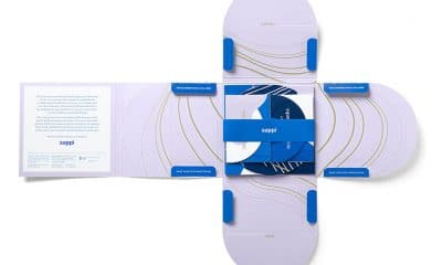
In winning the grand prize, @darkhorsewine leaned into most distinctive brand asset: its well known horse iconography.
https://www.bxpmagazine.com/5-brands-win-packaging-design-honors-in-designalytics-effectiveness-awards/
Mr. Reality Check tracks the truth behind online buying and impulse purchasing.
https://www.bxpmagazine.com/packaging-research-adapts-to-our-changing-world/
The new design features the diamond-shaped, orange Stewart’s logo front and center, along with the tagline “Iconic Just Got Spiked."
https://www.bxpmagazine.com/stewarts-spiked-seltzer-launches-new-look-packaging/