Awards
The 2020 DBA Design Effectiveness Awards
The DBA Design Effectiveness Awards are entered jointly by client and designer.
THE DESIGN BUSINESS Association is the trade association for the UK design industry, which promotes professional excellence through productive partnerships between commerce and the design industry to champion effective design that improves the quality of people’s lives.
Established in 1989, the DBA Design Effectiveness Awards celebrate the influence of design on the success of a project or business. The DBA Design Effectiveness Awards are entered jointly by client and designer; winning projects are rigorously judged by business leaders from organizations such as LEGO, Harley Davidson, Fortnum & Mason, GlaxoSmithKline, PUMA, Twitter and Lloyds Banking Group in three rounds of judging. Crucially, the awards are evidence-based, with the impact of design measured and verified.
Gold—Branding, Packaging
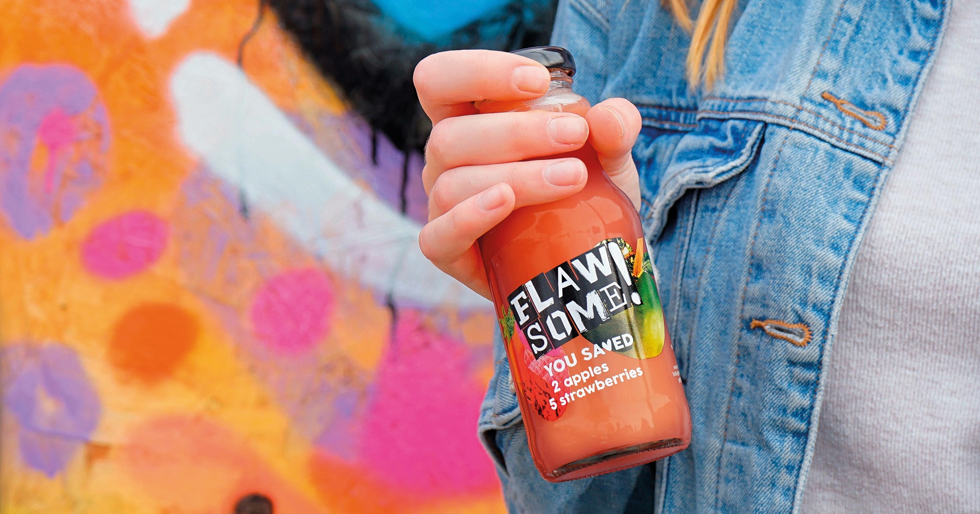
Flawsome!
By Coley Porter Bell
The transformational rebranding of a juice business projected its compelling story more powerfully, helping to double the brand’s followers on Twitter and facilitating increased PR exposure. With no other changes to the brand’s activities or marketing other than the redesign, sales leapt 540% in the year following relaunch, against a targeted increase of 100%.
Although its cold-pressed juice products were delicious and there was a great idea at the core of the business—to be a solution to the food waste problem by using surplus fruits from farmers—the brand’s growth had stalled.
Collaborating with agency Coley Porter Bell, the existing Get Wonky brand was redesigned from top to bottom. Changing its name to Flawsome! (inspired by the idea of “flawed but awesome”) and with a new positioning, identity, package design and brand story, which more clearly communicates the story behind the brand, Flawsome! significantly increased its relevance and distinctiveness in the premium juice market.
Previously, the brand was distributed by six wholesalers, but this leapt to 17 following the redesign, including German supermarket Edeka. The business had also been struggling to secure external investment, but rebranded as Flawsome! it acquired eight investors, enabling new product developments—further increasing distribution and sales.
Advertisement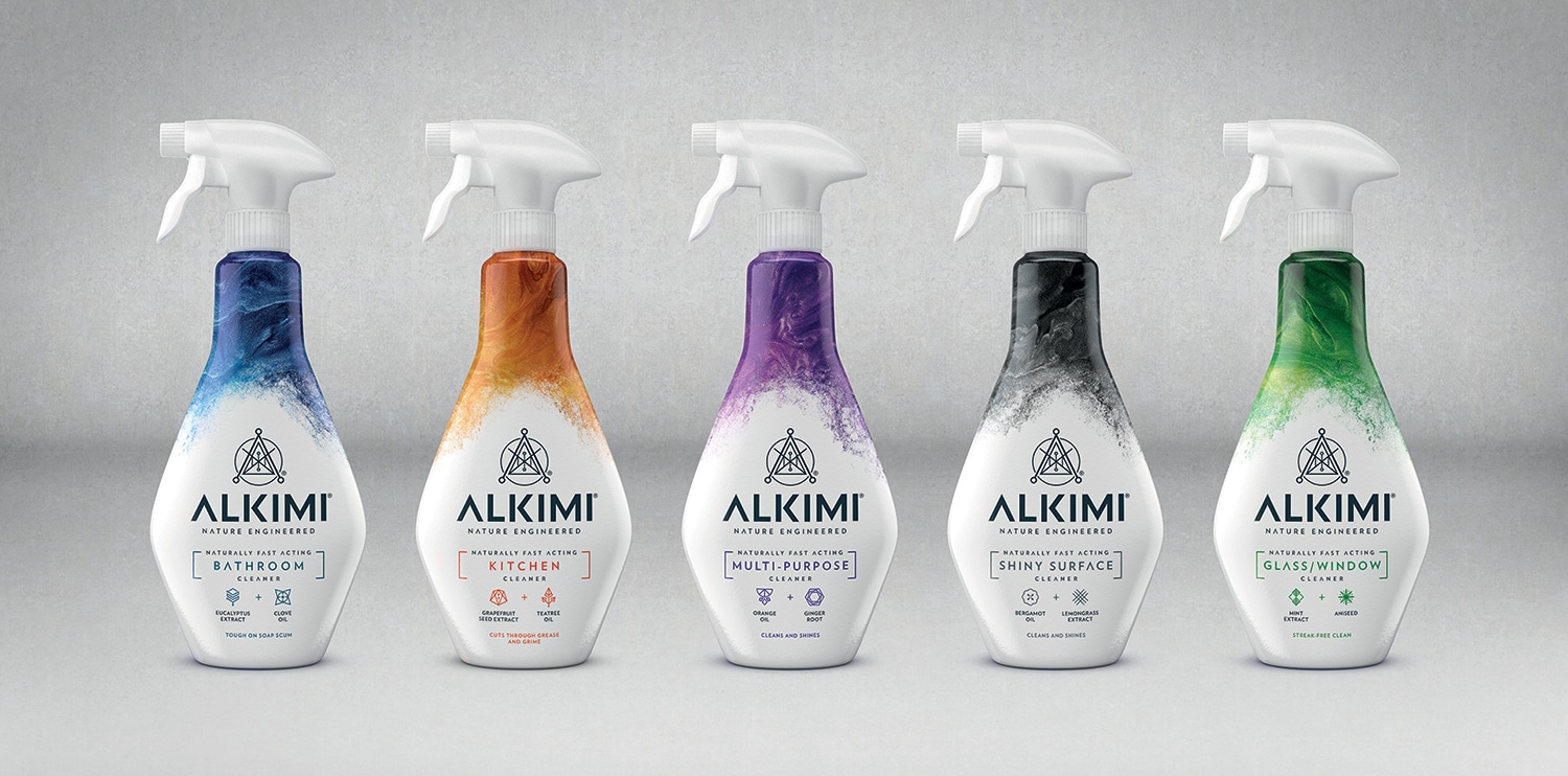
Silver—Branding, Packaging
ALKIMI Brand Creation
By Bulletproof
Entering a tough and shrinking category, a new cleaning innovation won over consumers with a brand and package design that credibly communicates the product’s efficacy and environmental credentials. The range achieved £600,000 worth of sales in its first 18 months and has been exported to 10 countries outside of the UK.
The challenge for Challs and Bulletproof was to create a brand positioning, name and brand world to persuade consumers that the new range was both eco-friendly and effective.
The brand name ALKIMI, brand symbol and bottle design and structure all reflect the science behind the product’s cleaning power as well as its synthesis with nature and provide excellent shelf standout. Incorporating a suite of symbols and surges of color, the sophisticated design makes range navigation easy, while the package’s bottle, trigger and sleeve are 100% recyclable.
With its aspirational brand design, ALKIMI secured listings in Ocado, Sainsburys, Booths and on Amazon in its first year, as well as in 3,000 independent stores. Its success led to the creation of new jobs at the business, including five roles focused on new product development for the brand. It also struck a chord with shoppers; 78% of consumers view ALKIMI as a premium product, and it’s been able to command £2.99 per bottle—the same price point as Method.
Advertisement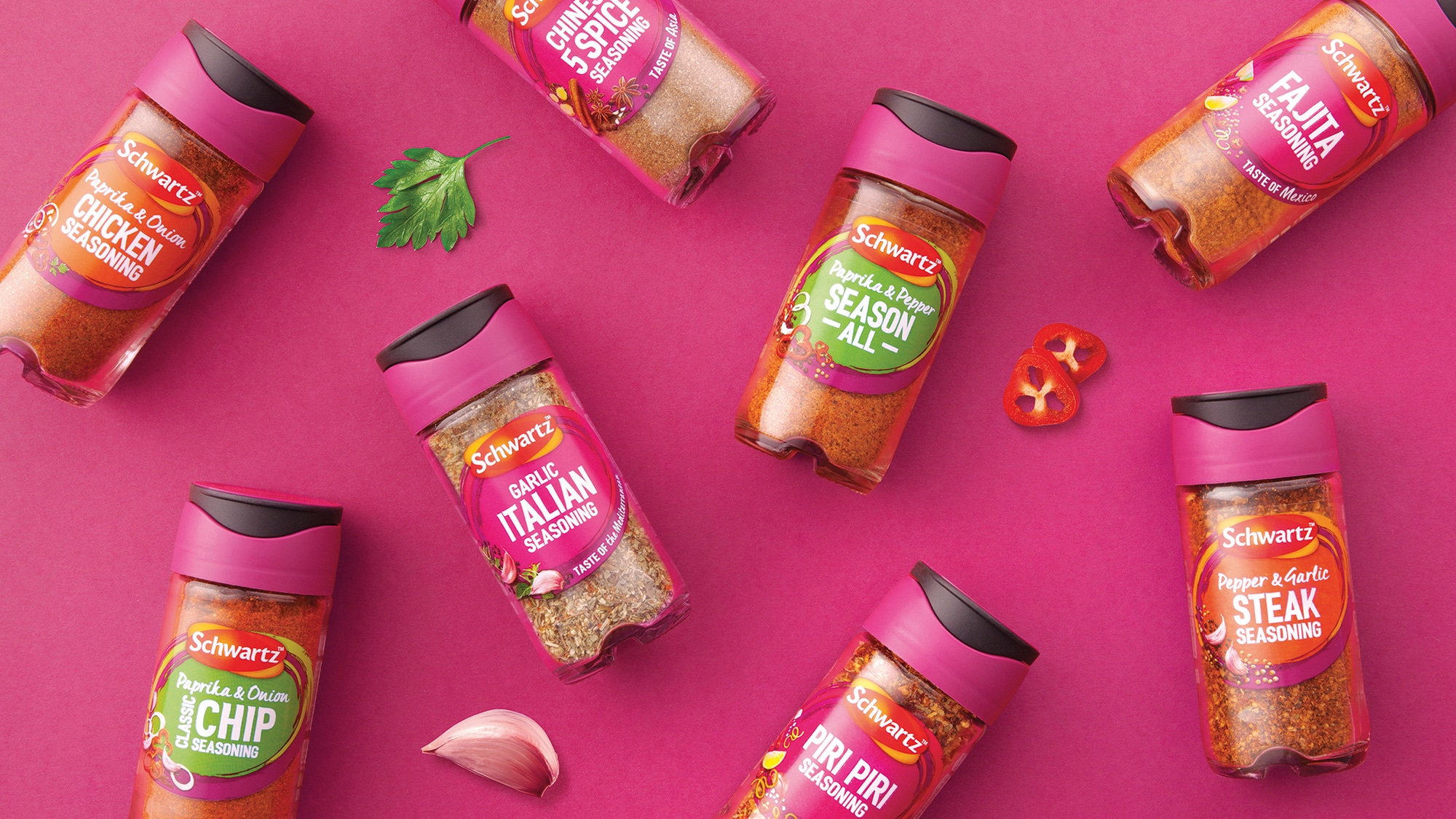
Silver—Branding, Packaging
McCormick
By BrandOpus & Marks
Whilst cultural interest in food has sky-rocketed, in contrast McCormick’s herbs, spices and seasonings brands (known as Schwartz in the UK) had been experiencing penetration decline. Despite being a key player in the category, it was perceived as old fashioned and was struggling to find relevancy with some demographics.
Collaborating with BrandOpus and Marks, McCormick’s shifted perceptions with a new positioning, identity and jar structure that moved the Schwartz brand from being perceived as a “functional kitchen” product to an “inspiring kitchen partner” and justified the brand’s price premium. Market penetration of the redesigned product line grew by 1.2 points, to 25% of the UK market.
Signifying the brand’s expertise and the dynamism of cooking, the new design and 3D structure, which handily fits a teaspoon, have driven up perception of the Schwartz brand making it less likely to be substituted with own label.
Regaining loyalty, Schwartz grew the value of its jars by 2.8% following the redesign, increasing share by 0.1 percentage points to 32.6%. Crucially the identity and positioning have allowed for innovation; the new Street Food seasonings reached 325,000 new households in a market segment that was deemed crucial to the brand.
Advertisement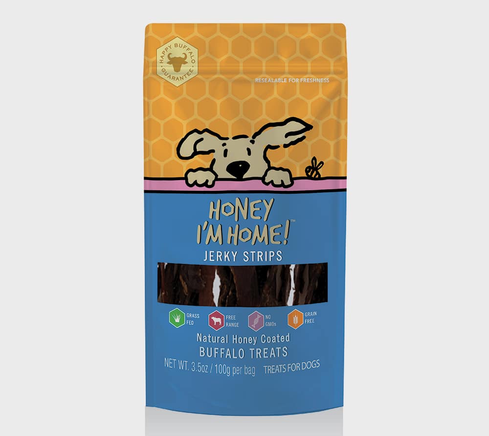
Silver—Branding, Packaging
Honey, I’m Home
By Lewis Moberly
In only 16 months, a small start-up transformed into a major pet food brand, achieving distribution in more than 1,000 locations across 45 U.S. states with the aid of striking design.
The challenge was to take ‘leftovers’ from India’s meat industry to the sophisticated U.S. pet food market. But dried ears and jerky have long been available in pet stores. Lewis Moberly’s design would need to differentiate the brand from competitors to enable it to become a top-tier player.
Insight into the anthropomorphism of pets was used to create Honey, I’m Home’s packaging and visual identity, which is deployed across a variety of brand vehicles include its website and social media. There was zero awareness of the brand at outset, but Honey, I’m Home rapidly gained traction. Rational and emotional components of its playful design resonate with dog owners, and they’ve connected with the brand on social media, with website visits and Instagram clicks to website growing 82% and 359% year-on-year.
By making unglamorous products, e.g., lung bites, seem friendly, the startup smashed its target of distribution across California in year one, securing 322 locations in 36 states and delivering sales 80% above benchmarks.
Silver—Branding, Packaging
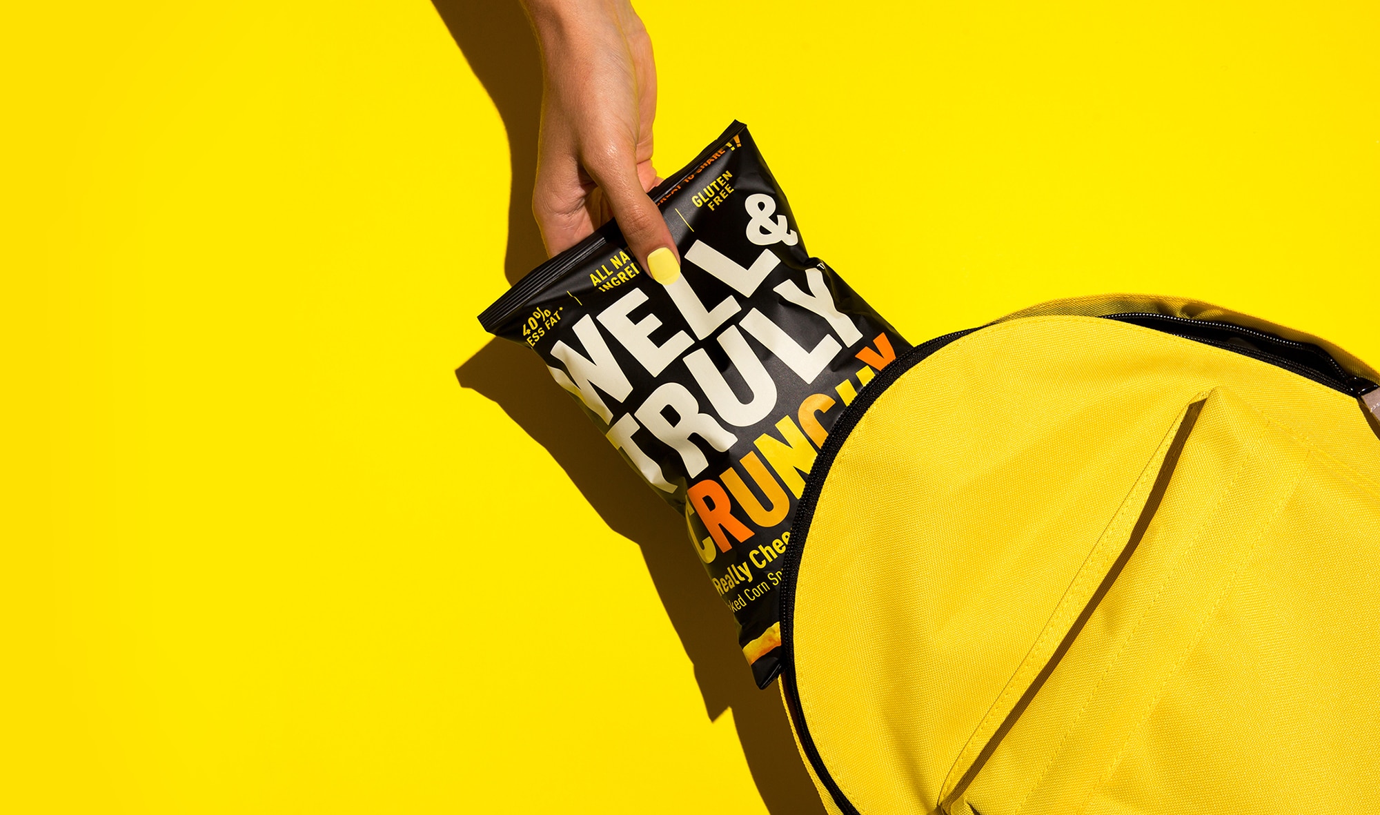
Product Well & Truly Rebrand
By B&B Studio
By reimagining Well & Truly as a tasty lifestyle brand rather than a restrained healthy snack, a 104% uplift in gross sales was immediately delivered. This growth is double the target, was achieved with no advertising support. Within 16 months on from redesign, the impact hadn’t waned, with sales steadily increasing week-on-week.
Well & Truly launched in 2016 as a gluten-free alternative to mainstream snacks. By 2018, growth had plateaued, and it had failed to win a listing on a mainstream supermarket snacking aisle. A radical repositioning and full rebrand, encompassing visual identity, packaging, social media and brand activity, aligned Well & Truly with qualities integral to the mainstream snacking moment—joyfulness, pleasure and taste.
The redesign by B&B Studio grabbed the attention of customers and changed the perception of consumers. Sainsbury’s and Booths listed Well & Truly, placing it in the highly competitive, mainstream snacking aisle; overall distribution grew 50% in six months. Significantly, with the brand differentiated from female-focused healthy snacks, Well & Truly’s online audience shifted from 20% to 40% male. This repositioning not only helped the brand win new male consumers, it also helped Well & Truly’s steal marketshare from Walkers.
- Grupo imasD Takes Top Prize in the 2020 Makeover Challenge
- 17th Annual BXP Makeover Challenge
- 2020 VERTEX Awards
- Pentawards 2020
- 77th Annual North American Paperboard Packaging Competition
- 2020 PAC Global Leadership Awards
- National Association of Container Distributors Packaging Awards
- 2020 IoPP AmeriStar Package Competition
- 27th Annual FSEA Gold Leaf Awards
- 2020 FPA Flexible Packaging Achievement Awards Competition
- 2020 Packaging Innovation Awards
- The 2020 DBA Design Effectiveness Awards
- 2020 Dieline Awards
- 2020 Designalytics Effectiveness Awards In Partnership With Dieline
- The 2020 DBA Design Effectiveness Awards
Branding with Ferocity – Thinking Like an Indie Brand
Get a better understanding on how to leverage new technologies to engage and delight shoppers, sustainability’s role in product and package design – being sustainable and premium are not mutually exclusive, plus best practices and tips for collaboration and how to launch new products and refresh existing product line-ups and brands.


GO MINIMALISM . . . HOLD ON A MINUTE!
Sustainable, 100% Recycled Transparent Sheeting is Now a Reality!

Kroger, Walgreens to Dedicate Section of Their Stores to Reusable Packaging

6 Marketing Tips for Ecommerce Brands to Win the Holiday Shopping Season

New Wunderoots Branding Celebrates the Carrot

Fact or Fiction? The Truth about Eco-Friendly Packaging

BXP May 2021 Think & Clink

Unilever Raises Bar for Accessibility with Degree Inclusive

Crown Royal’s Limited-Edition Pack Designed by Oscar-Winner
Coca-Cola Explores World of Paper Bottles

BULLETINS
Get the most important news and business
ideas from BXP Magazine's news bulletin.