Beer Wine Spirits and Cannabis
How Samuel Adams’ Package Redesign Conveys “More Flavor” With Less Backstory
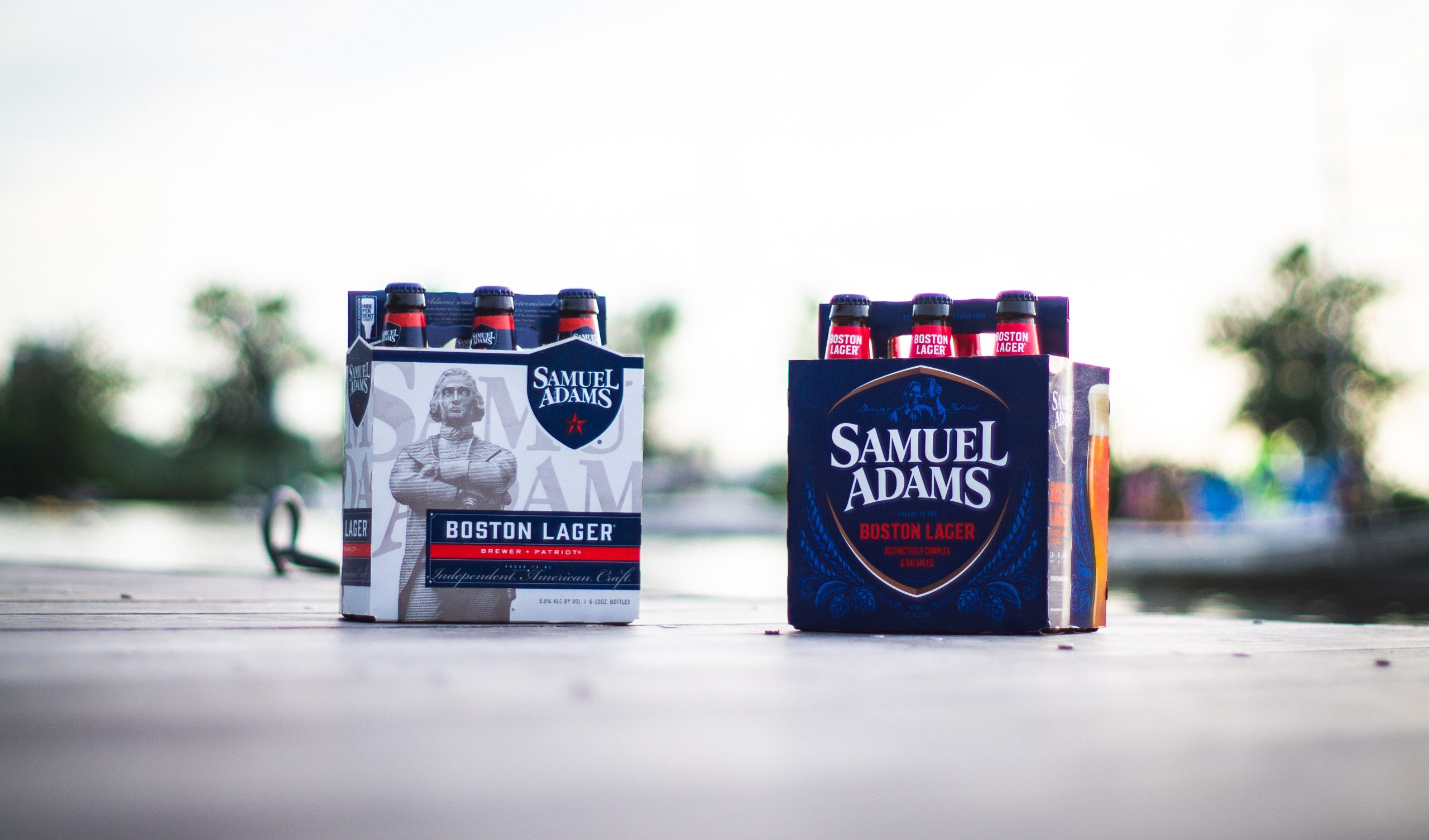
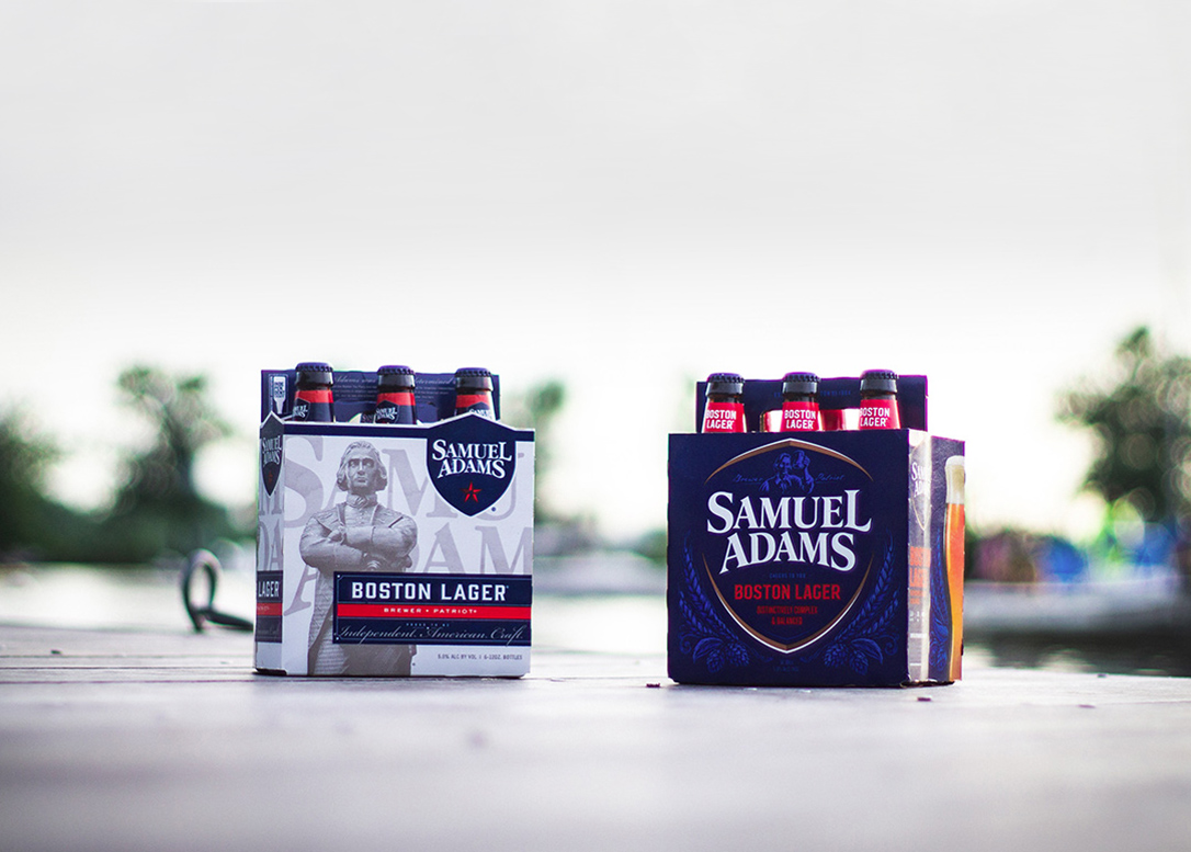
In summer 2019, Samuel Adams rolled out a dramatically different package design for its Boston Lager brew—trading in its austere patriotic facade for an arguably less complicated, more modern look. Extreme makeovers are rare for established brands, but larger beverage-alcohol players have been under fire in recent years, forced to fend off slews of smaller entrants—many of whom wield design like a weapon. In fact, 1,049 new breweries opened in the United States last year, with craft beer volume growth outpacing the overall beer market, according to the Brewers Association. Like other category heavyweights, the Samuel Adams brand had begun to suffer a decline in sales, so perhaps a “revolutionary” reboot was in order.
Advertisement
The new design, which was released this past summer, spotlights the Samuel Adams logo. In making room for this centerpiece, the updated packaging drops the surly statue of Samuel Adams himself who, incidentally, looked more like a fusty nightclub bouncer than a good-natured drinking companion. (The new rendition of Samuel Adams’ likeness better fulfills the role of merrymaker, despite being deemphasized on the package.) The brand also softened its red, white, and blue color scheme. By adding a second, lighter shade of blue, the coloring feels more considered and cohesive, and less like the “go-to” patriotic palette.
According to a new Designalytics report, which evaluated the current and previous designs with hundreds of beer buyers, consumers prefer the new design to the old design by a ratio of 2:1. This finding is validated by the brand’s recent performance in market; the launch of the new design appears to have helped transform a steady sales decline into modest brand growth. During the 16 weeks prior to the packaging change, sales for Samuel Adams Boston Lager had declined by 14.2% compared to the same period in 2018. During the 16 weeks following the new design’s launch, year-over-year sales reflected a modest growth rate of 0.5%.1 This is an impressive feat for any brand, considering that only half of package redesigns actually improve on the original design. For an established brand in a fiercely competitive category that tends to favor the new and “crafty,” this outcome is especially commendable.
The “why” behind the winning design
Most discussions of package design effectiveness focus on the topline result — do consumers like the new design more? — and that’s about it. However, it’s worth a peek under the hood; understanding why one design is more successful than another can inform a brand’s ongoing communications strategy and future marketing efforts. So why is Samuel Adams’ new design resonating with consumers?
To answer this question, let’s first consider the broader cultural context predating the latest design’s launch. In 2016, Boston Beer had just rolled out a new design with a decidedly patriotic bent; the Olympics and the presidential election were on the near-horizon, and a host of other brands—such as Coca-Cola, Budweiser, Skittles, and Smirnoff—had released special-edition packaging that celebrated America. At the time, patriotic packaging was a no-brainer for a brand like Samuel Adams—but over the past few years, patriotism has become a controversial topic that many brands have had to navigate with care.
AdvertisementIn Designalytics’ 2019 consumer evaluation, the statue of Samuel Adams—an important patriotic figure—emerged as the most polarizing package element for a variety of reasons; consumers who disliked it cited the effigy’s potential political overtones and its stern demeanor. Overall, consumers were more likely to associate words like “patriotism,” “history,” “American,” and even “president” with the older packaging.
The new design significantly softens patriotic associations; none of these words surfaced when consumers were asked to share their first impressions of the updated packaging. Moreover, when asked which design “tells a story,” only 23% of consumers chose the new design, while 76% chose the old one—a massive communication shift when compared with other package redesigns across categories.
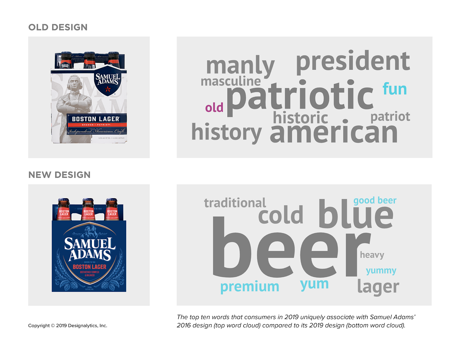
Overall, the brand’s new packaging celebrates simplicity; it spotlights “beer” in consumers’ minds and downplays perceptions related to politics (“patriotic,” “American”) and gender (“manly,” “masculine”). In their place, it evokes positive associations, including “good for casual parties,” “keeps up with the times,” and the all-important “tastes great.” In fact, the new design elicits an abundance of positive sensory and quality associations (“yum,” “good,” “premium”). It manages to achieve this without adding product imagery or other standard visual cues designed to appeal to the senses, save some copy that reads, “distinctly complex and balanced.” This suggests that the brand’s strong historical backstory, as reflected in the 2016 packaging, may have eclipsed positive taste associations that consumers already held for the brand. By softening and simplifying Samuel Adams’ story, the new design creates more space for other associations that are closely tied to purchase intent.
Advertisement

Samuel Adams demonstrates the importance of keeping a pulse on consumers’ changing perceptions, motivations, and purchase drivers—and making adjustments that remain true to the brand’s heritage. These include spotlighting much-loved design elements and evolving brand assets that generate mixed reactions; in Samuel Adams’ case, these included the package’s color and scheme and the depiction of the man himself. Brands with this depth of self-awareness inevitably make the kind of well-considered design decisions that produce stellar in-market outcomes. Cheers, Sam!
1 IRI, total U.S., multi-outlet plus convenience, latest 32 weeks ending 9/8/2019. Data for Samuel Adams Boston Lager long-neck bottles (6-packs). Other factors beyond the packaging change, such as increased advertising and promotions, may have also contributed to the sales impact. Based on a custom research analysis with IRI data.
Branding with Ferocity – Thinking Like an Indie Brand
Get a better understanding on how to leverage new technologies to engage and delight shoppers, sustainability’s role in product and package design – being sustainable and premium are not mutually exclusive, plus best practices and tips for collaboration and how to launch new products and refresh existing product line-ups and brands.


BULLETINS
Get the most important news and business
ideas from BXP Magazine's news bulletin.