Hard seltzer has burst onto the scene, with enormous sales pushing the challenger category to mainstream prominence in both the beverage aisle and beer buyer’s imagination. According to Nielsen, hard seltzer sales totaled $2.7 billion at the end of June—10% of the total beer/cider/malt beverage market.
To help Kona Spiked Island Seltzer break out in the crowded hard seltzer category, Kona Brewing Co. turned to its design team at Flint Design Co.—a Portland firm with more than 27 years of brand and packaging experience—for a new brand identity that would stand apart in a meaningful way.
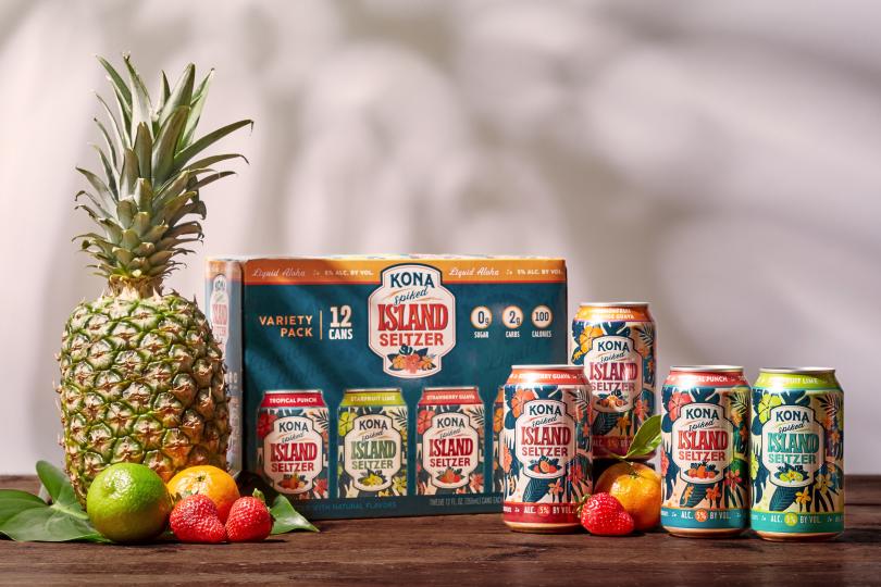
The Flint team immediately recognized the visual standards established by the category leader and its many followers: clean, white background, minimal look. They quickly made the decision to resist mirroring the trend and instead stay true to what’s authentically Kona—rich, colorful, and never to be mistaken for any another seltzer in the aisle.
Flint built a brand, positioning, story, and visual identity that, like Kona’s beer packaging, sought an emotional connection to Hawaii at first glance. But unlike Kona’s beer offerings, where a single Hawaiian location acts as inspiration, the Flint team positioned Kona Seltzer as a sensory experience that spans Hawaii’s lush islands—highlighting a culture and environment that’s beloved by locals and visitors alike.
A hand-drawn aesthetic was chosen to reflect the sense of compassion Hawaiian culture places on all living things—their islands, plants, animals, people, and communities. And soon, sketches of vibrant fruits and flowers filled the sketchbook of Flint designer Crystal Peck.
“That genuine humanity,” Peck says, “is a hallmark of Hawaii.”
Advertisement
The palm fronds, monstera leaves, tropical fruits, and bright florals communicate the brand’s essence—a feeling of being whisked away to paradise with every sip. The Flint team studied mid-20th-century cocktail graphics, aloha shirt patterns, travel posters, and album covers, choosing carefully to evoke an “Old Hawaii” feeling while avoiding over-the-top cultural caricatures. The resulting design was a tropical package that’s unmistakably Hawaii and undoubtedly Kona.
“Like Americana, Hawaiiana is an important way to think about Hawaii,” says Flint owner Catherine Healy. “It celebrates the native Hawaiian ancestry, the artistry and the culture that draws people from around the world to visit this very special place and is the source of pride for locals, too.”
Luaus and tiki bars inspire a playful energy in the concept. Custom lettering and a new logo badge bring the design together, while a roaming gecko on each of the cans connects Kona Seltzer to its larger brand story—something the Flint team recognized as missing from the category. They hoped such detail would immediately connect to Kona’s loyal beer drinkers while also enticing a whole new audience.
“One of my favorite things to do as a designer is to have fun with the details; to give people something to discover and smile about,” Peck says. “I loved bringing the gecko from the Kona Brewing Co. beer logo to life as a character that moves about the cans.”
During consumer testing, seltzer drinkers said the colorful, floral designs grabbed their attention, while the package clearly communicated the refreshing flavors and important benefits seltzer fans look for. And since its release, sales volumes are rapidly growing week over week as they gain distribution and drive preference, according to Kona senior director of brand marketing cindy Wang.
“Flint’s design work has truly differentiated Kona Spiked Island Seltzer in a crowded space,” says Wang, noting the Kona team has been delighted to see customers already acting as brand ambassadors by sharing images of the colorful cans on social media. “Consumers see it as uniquely tropical in a sea of sameness—which also has retail buyers excited.”
Advertisement
Evoking a consumer’s desire to show off a product package is part of the Flint team’s thinking from the start. After nearly three decades and countless evolutions in thinking around package design, Healy says today’s designs need to do more than represent the brand and product attributes—they need to connect on a deep emotional level.
“People choose brands that represent an extension of their lifestyle,” she says. “Packages have moved beyond their refrigerator—they’ve become a way of representing their story and values.”
Editorial Note: This post was shared by a member of the BXP magazine community using our Community Voice tool.
Our website community uses the tool to post articles, thought-leadership reports and analyses, white papers, case studies, blog entries and op-eds, press releases and events about brand and package design or marketing. These posts are vetted and edited by our editorial staff for editorial relevance and decorum for branding, design, marketing and package design professionals. Approved and edited content then lives side-by-side with other editorial content. Overtly promotional content is not accepted, but we do have advertising options available for those interested in promoting their services or products.
Advertisement
Do you want to become a contributing author to the BXP website? Click here to learn how you can become a contributing member of the BXP Magazine community.