Bold and contemporary graphic re-design of Morton Salt’s entire portfolio of retail products refreshes iconic brand and reinforces its heritage of quality and trust
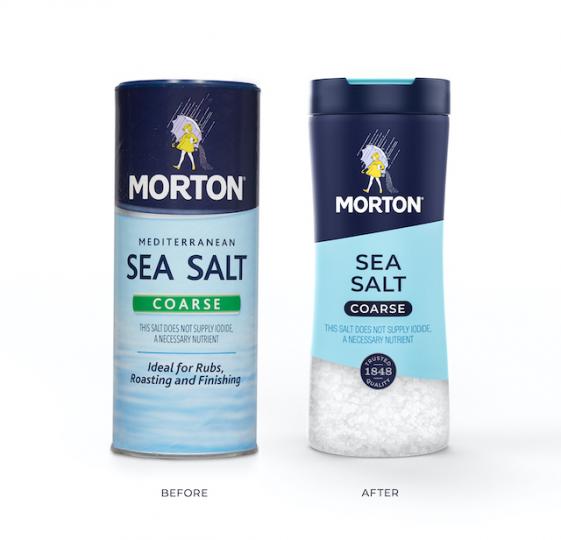
Morton Salt, one of America’s favorite and most enduring brands, has debuted a fresh new look on packaging to bring more flavor to its entire line-up of retail products. The eye-catchingly bold and contemporary design refreshes the iconic brand that consumers have known and loved for generations, while making its products more shoppable in today’s dynamic digital and in-store environment.
“Morton Salt has been part of hearts and homes all across America for more than a century,” said Denise Lauer, Chief Marketing Officer, Morton Salt, Inc. “As we continue to expand our brand and product portfolio, it is imperative to evolve our packaging for the future with more modern cues and a design system that helps consumers understand the variety, benefits, and versatility we have to offer across our culinary and home care categories.”
Morton partnered with creative agency, Chase Design Group, to develop a premium visual design that showcases brand colors, striking geometric angles and sans serif type to help make the packaging easier for consumers to navigate on shelf. The design system is anchored by the beloved Morton Salt Girl and a quality seal that highlights the company’s origins, which date back to 1848. In addition, Morton’s new packaging graphics feature more educational content about salt usage and carry the “How 2 Recycle” label to help consumers properly recycle its packaging.
The stylish new design stretches across Morton’s entire retail portfolio, spanning both culinary and home care products—from Morton® Kosher Salt, Sea Salt and Himalayan Pink Salt to Morton® Water Softener Salt, Pool Salt, Ice Melt products and more.
Lauer added: “We’re taking a bold step into the future to enhance the experience for millions of consumers who turn to Morton Salt to flavor food, improve water quality and make life better. Rooted in extensive research and insights, we believe our new packaging design better reflects the needs of today’s consumers, while reinforcing our brand strength and heritage across the full portfolio of Morton products.”
Advertisement
“We successfully combined Morton’s iconic brand assets with clean typography and bold graphic shapes to create a design system that celebrates Morton’s rich history while feeling relevant to today’s consumers,” said Clark Goolsby, Chief Creative Officer, Chase Design Group, New York.
For Morton’s comprehensive line of culinary salts, it was important to create a design system that would clearly communicate the differences between product offerings. “This was achieved with a mix of interchangeable elements including transparent windows, usage occasion photography, color coding, iconography and typography,” he adds. For its home care line, the Morton brand was given greater prominence while design elements were simplified across the full range of packaging structures.
Morton Adds a Dash of Augmented Reality to New Packaging
To support the rollout of its new packaging look, Morton will launch an integrated marketing campaign which includes in-store, digital and social media activations, as well as PR and influencer programs. In addition, Morton is releasing a new augmented reality experience that can be activated on select culinary salts featuring the new packaging design. The experience will enable consumers to engage with the Morton brand in several fun and educational ways.
“As consumers continue to spend more time at home cooking and bring new digital tools and technology into the kitchen, this is the perfect time to deliver an all-new experience with the Morton brand,” Lauer added. “Consumers can simply scan the QR code on specially marked Morton culinary products, then choose from various augmented reality experiences, including interactions with our new packaging, recipe content and the Morton Salt Girl.”
And in keeping with Morton Salt’s mission to Erase Food Waste, the augmented reality experience will provide recipe inspiration based on ingredients that consumers already have on hand at home, so they can make the most of mealtime with Morton.
Advertisement
Morton is already rolling out its new packaging design at retailers across the country. Consumers can find the new look on their favorite home care products in-store and online now. Morton’s updated culinary products will continue to rollout through the end of the year. Look for Morton culinary products with the QR code tags to activate the augmented reality experience launching later this year.
To learn more about Morton’s wide range of salts, or for recipe inspiration, visit www.mortonsalt.com and follow @MortonSalt on Instagram, Facebook and Pinterest.
About Morton Salt, Inc.
Morton Salt, Inc. is a trusted authority in salt in North America. Our iconic Morton® brand, coupled with the broadest footprint in the industry, has made us a leader since 1848. We produce salt for culinary, water softening, household, road deicing, food processing, chemical, pharmaceutical, and numerous other uses. Headquartered in Chicago, Morton Salt with its affiliates in the Bahamas and Canada has nearly 3,000 employees committed to safety, quality, and service in the communities in which we operate.
About Chase Design Group
Chase Design Group (www.chasedesigngroup.com) is a creative agency with offices in Los Angeles, New York, Seattle and the UK, and is dedicated to exploring new territory and questioning conventional assumptions to produce extraordinary outcomes. Founded in 1986 by the late Margo Chase, the firm’s expertise spans brand strategy, identity development, package design and retail environments for clients including Procter & Gamble, PepsiCo, Nestlé, Campbell Soup Company and Pfizer. Driven by the insatiable curiosity and love of design inspired by founder Margo Chase’s leadership and legacy, the team is committed to carrying her vision for the organization forward.
Advertisement
Editorial Note: This post was shared by a member of the BXP magazine community using our Community Voice tool.
Our website community uses the tool to post articles, thought-leadership reports and analyses, white papers, case studies, blog entries and op-eds, press releases and events about brand and package design or marketing. These posts are vetted and edited by our editorial staff for editorial relevance and decorum for branding, design, marketing and package design professionals. Approved and edited content then lives side-by-side with other editorial content. Overtly promotional content is not accepted, but we do have advertising options available for those interested in promoting their services or products.
Do you want to become a contributing author to the BXP website? Click here to learn how you can become a contributing member of the BXP Magazine community.