Awards
2020 VERTEX Awards
The aim is to celebrate the best in private brand packaging design.
THE VERTEX AWARDS aims to celebrate the best in private brand packaging design. This year’s record-setting class of entrants is evidence of not only Vertex’s influence on design but strategy. Retailers, agencies and manufacturers have moved beyond the expected and created brands and package design that genuinely differentiates. The 2020 competition included more than 400 entries from 27 countries and 49 retailers.
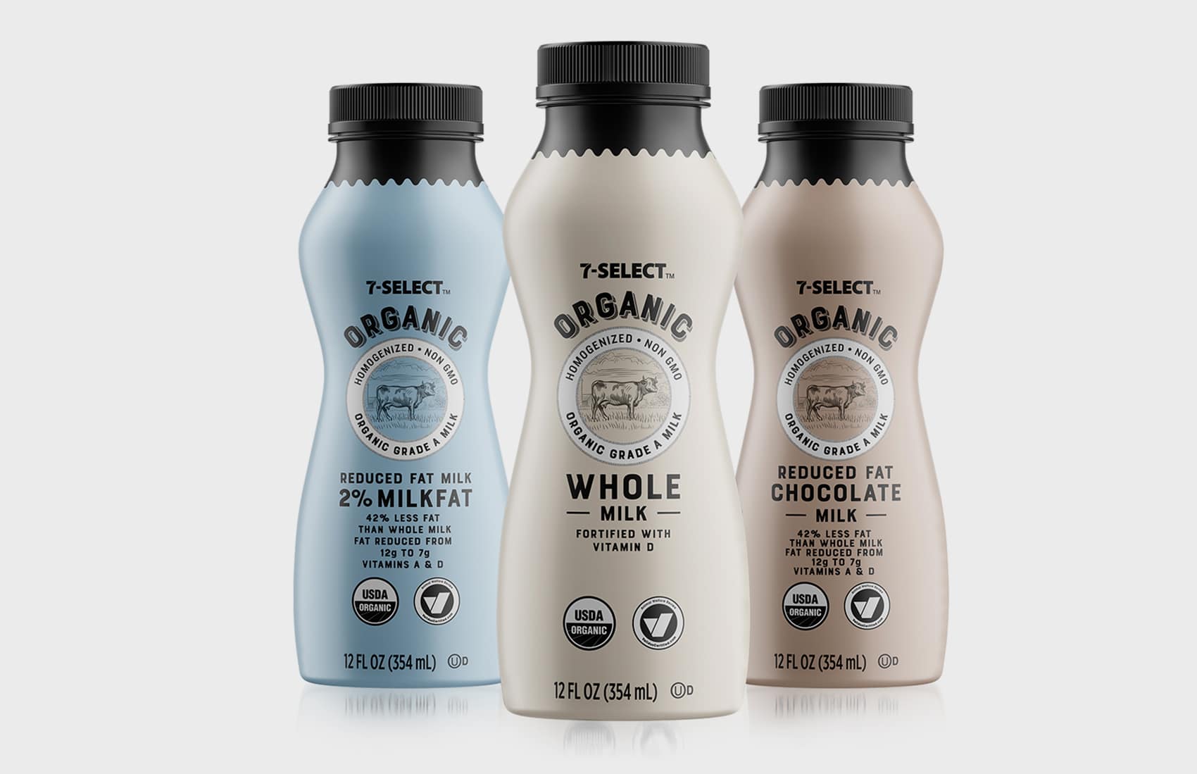
Gold, Category G6. Beverages: Non-Alcoholic
7-Select Organic Single Serve Milks
By Marty DiFrisco, account manager, MBD; Tracy LeMere, creative director, MBD; Austin Sniezek, project manager, MBD; Sandra Button, designer, MBD; Roger Calado, production artist, MBD
The team designed this artwork with a color palette and illustrations that have a slightly retro feel. This brings the design back to times when simple, fresh and organic were the standard, not the exception, and the sourcing of a product was clear. The illustrations help remind customers that they can expect a high level of quality, freshness and product-sourcing transparency from 7-Eleven.
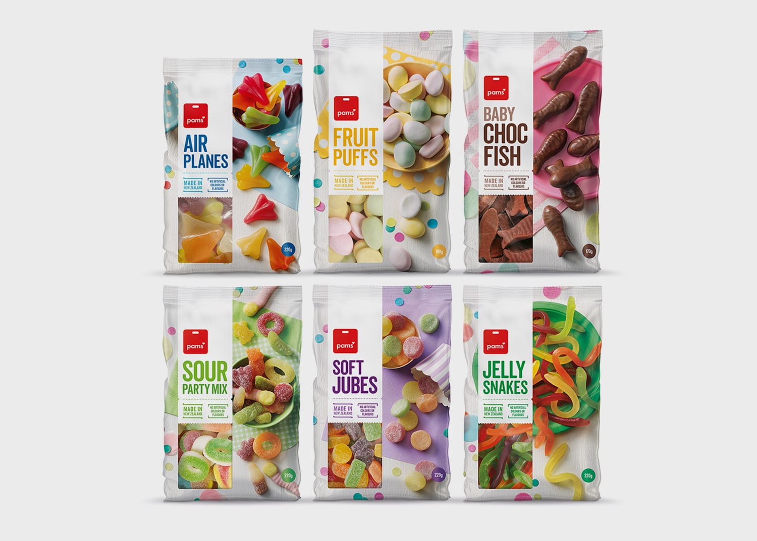
Gold, Category G3. Packaged Goods
Pams Confectionery
By Justine Rankine, creative director and senior designer, Brother Design; Nicole Blackwood, senior account manager, Brother Design; Melanie Jenkins, photographer, Flash Studios; Jo Wilcox, food stylist, Silverspoon; Melissa Steffensen, marketing manager, Foodstuffs Own Brands Limited
Redesigned Pams Confectionery packaging fits within the new Pams brand design look, with a visually stunning design that stands out on shelf by looking appealing and fun whilst communicating that the sweets contain no artificial colors or flavors. The creative solution creates a setting using vibrant pops of color with delightful props against fresh white wood—evoking contemporary party appeal for all ages.
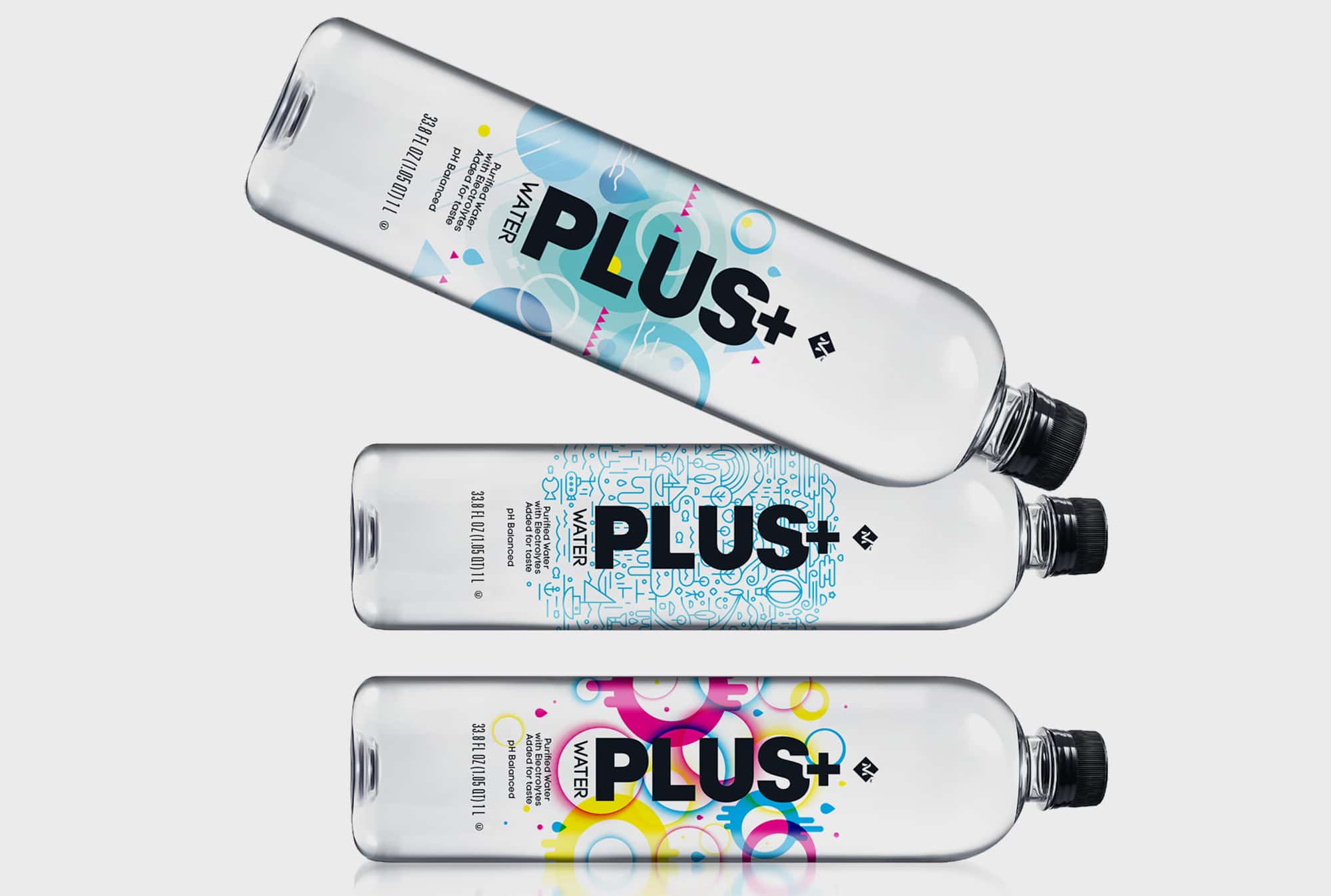
Gold, Category: G6. Beverages: Non-Alcoholic
Enhanced PLUS+ Water
By Jonathan Stiers, senior creative director, Sam’s Club; Carrie Mapes, account lead, Equator Design; Josh Weigelt, designer, Equator Design
“Art + Water = Something Better” became the mantra and tagline for PLUS+ Water, the new electrolyte water from Member’s Mark. This premium enhanced water features a collection of badge-worthy designs that together highlight the product benefits (added electrolytes) and establish an ownable name in the market.
Driven by the new tagline, the creative collaboration resulted in designs incorporating depictions of water in various forms. From abstracted liquids and aqua-inspired icons to a representation of the water-cycle — each bottle tells a unique story.
Hydration meets style, as the clear label substrate showcases crystal clear water and allows maximum contrast with the vibrant, abstract graphics. The large bottle structure allows the consumer to stay hydrated for hours and accessorize their look with these aspirational bottles.
Advertisement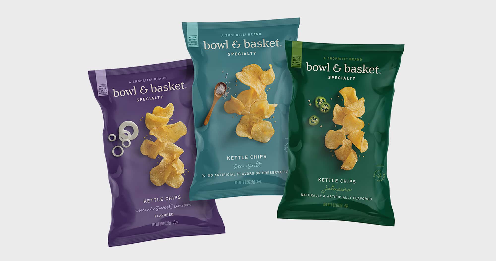
Best of Show Winner, Category G3. Packaged Goods
Bowl & Basket Specialty Kettle Chips
By Laura Kind, vice president of brand strategy, Wakefern; Glenn Pfeifer, design manager, Wakefern; design team, Pearlfisher; production team, SGS Co.
As Wakefern embarked upon re-imagining all aspects of its private brand portfolio, the retailer sought to create a private-label food brand that moved from blending in to standing out. The retailer’s banner brands were already well known pillars of their communities, and it wanted the new brand to reflect that sense of community and of sharing. Bowl & Basket represents food that brings people together and creates memories for the retailer’s shoppers and their families. It is a brand that celebrates the diversity and deliciousness of all of Bowl & Basket’s products, the care that went into making them, and the packaged products’ ability to bring people together.
- Grupo imasD Takes Top Prize in the 2020 Makeover Challenge
- 17th Annual BXP Makeover Challenge
- 2020 VERTEX Awards
- Pentawards 2020
- 77th Annual North American Paperboard Packaging Competition
- 2020 PAC Global Leadership Awards
- National Association of Container Distributors Packaging Awards
- 2020 IoPP AmeriStar Package Competition
- 27th Annual FSEA Gold Leaf Awards
- 2020 FPA Flexible Packaging Achievement Awards Competition
- 2020 Packaging Innovation Awards
- The 2020 DBA Design Effectiveness Awards
- 2020 Dieline Awards
- 2020 Designalytics Effectiveness Awards In Partnership With Dieline
- 2020 VERTEX Awards
Branding with Ferocity – Thinking Like an Indie Brand
Get a better understanding on how to leverage new technologies to engage and delight shoppers, sustainability’s role in product and package design – being sustainable and premium are not mutually exclusive, plus best practices and tips for collaboration and how to launch new products and refresh existing product line-ups and brands.


GO MINIMALISM . . . HOLD ON A MINUTE!
Sustainable, 100% Recycled Transparent Sheeting is Now a Reality!

Kroger, Walgreens to Dedicate Section of Their Stores to Reusable Packaging

6 Marketing Tips for Ecommerce Brands to Win the Holiday Shopping Season

New Wunderoots Branding Celebrates the Carrot

Fact or Fiction? The Truth about Eco-Friendly Packaging

BXP May 2021 Think & Clink

Unilever Raises Bar for Accessibility with Degree Inclusive

Crown Royal’s Limited-Edition Pack Designed by Oscar-Winner
Coca-Cola Explores World of Paper Bottles

BULLETINS
Get the most important news and business
ideas from BXP Magazine's news bulletin.